Models and Relationship between Variables
We will see in this note
how to visualize the relationship between 2 Qualitative variables
how to visualize the relationship between 2 Quantitative variables,
corrplotpackagehowto use
ggfortifypackage to visualizing results of statistical modelsExplore
tabplotpackage for a quick visualization of large data
2 Qualitative variables
Contingency table: Mosaic plot
> require(graphics)
> M <- as.table( cbind( c( 18,28,14), c( 20,51,28) , c( 12,25,9)))
> dimnames( M) <- list( Husband = c(" Tall", "Medium", "Short"), Wife = c(" Tall"," Medium", "Short"))
> M
        Wife
Husband   Tall  Medium Short
   Tall     18      20    12
  Medium    28      51    25
  Short     14      28     9
The object M created above is called a contingency table and we use usually a Mosaic plot to display the relationship between the observed qualitative variables
> mosaicplot( M, col = c(" green", "red"),main = "Husband x Wife")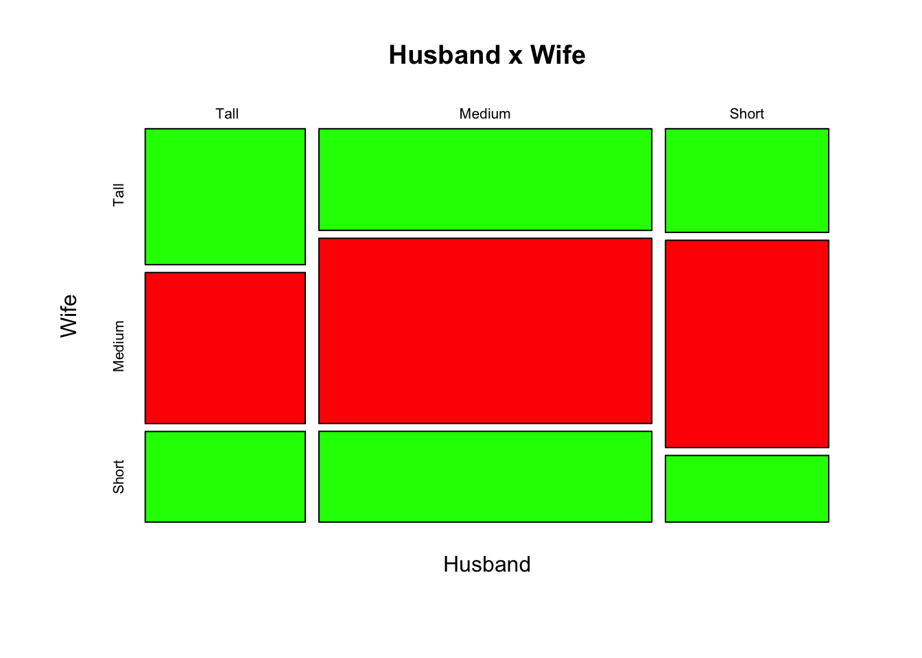
We can add the result of the Chisq Hypothesis testing
> library(vcd)
Loading required package: grid
> mosaic(M, shade=T,main = "Husband x Wife")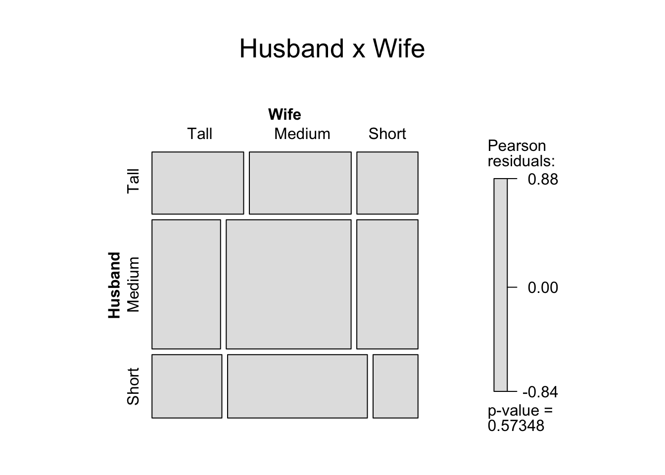
Radial or Radar charts
Radial or Radar charts are
- called Spider or Web or Polar charts.
- a way of comparing multiple quantitative variables.
- are also useful for seeing which variables are scoring high or low within a dataset.
We use the following R function
> source('CreatRadialPlot.R')
> CreateRadialPlot
function (plot.data, axis.labels = colnames(plot.data)[-1], grid.min = -0.5,
    grid.mid = 0, grid.max = 0.5, centre.y = grid.min - ((1/9) *
        (grid.max - grid.min)), plot.extent.x.sf = 1.2, plot.extent.y.sf = 1.2,
    x.centre.range = 0.02 * (grid.max - centre.y), label.centre.y = FALSE,
    grid.line.width = 0.5, gridline.min.linetype = "longdash",
    gridline.mid.linetype = "longdash", gridline.max.linetype = "longdash",
    gridline.min.colour = "grey", gridline.mid.colour = "blue",
    gridline.max.colour = "grey", grid.label.size = 4, gridline.label.offset = -0.02 *
        (grid.max - centre.y), label.gridline.min = TRUE, axis.label.offset = 1.15,
    axis.label.size = 3, axis.line.colour = "grey", group.line.width = 1,
    group.point.size = 4, background.circle.colour = "yellow",
    background.circle.transparency = 0.2, plot.legend = if (nrow(plot.data) >
        1) TRUE else FALSE, legend.title = "Cluster", legend.text.size = grid.label.size)
{
    var.names <- colnames(plot.data)[-1]
    plot.extent.x = (grid.max + abs(centre.y)) * plot.extent.x.sf
    plot.extent.y = (grid.max + abs(centre.y)) * plot.extent.y.sf
    if (length(axis.labels) != ncol(plot.data) - 1)
        return("Error: 'axis.labels' contains the wrong number of axis labels")
    if (min(plot.data[, -1]) < centre.y)
        return("Error: plot.data' contains value(s) < centre.y")
    if (max(plot.data[, -1]) > grid.max)
        return("Error: 'plot.data' contains value(s) > grid.max")
    CalculateGroupPath <- function(df) {
        path <- as.factor(as.character(df[, 1]))
        angles = seq(from = 0, to = 2 * pi, by = (2 * pi)/(ncol(df) -
            1))
        graphData = data.frame(seg = "", x = 0, y = 0)
        graphData = graphData[-1, ]
        for (i in levels(path)) {
            pathData = subset(df, df[, 1] == i)
            for (j in c(2:ncol(df))) {
                graphData = rbind(graphData, data.frame(group = i,
                  x = pathData[, j] * sin(angles[j - 1]), y = pathData[,
                    j] * cos(angles[j - 1])))
            }
            graphData = rbind(graphData, data.frame(group = i,
                x = pathData[, 2] * sin(angles[1]), y = pathData[,
                  2] * cos(angles[1])))
        }
        colnames(graphData)[1] <- colnames(df)[1]
        graphData
    }
    CaclulateAxisPath = function(var.names, min, max) {
        n.vars <- length(var.names)
        angles <- seq(from = 0, to = 2 * pi, by = (2 * pi)/n.vars)
        min.x <- min * sin(angles)
        min.y <- min * cos(angles)
        max.x <- max * sin(angles)
        max.y <- max * cos(angles)
        axisData <- NULL
        for (i in 1:n.vars) {
            a <- c(i, min.x[i], min.y[i])
            b <- c(i, max.x[i], max.y[i])
            axisData <- rbind(axisData, a, b)
        }
        colnames(axisData) <- c("axis.no", "x", "y")
        rownames(axisData) <- seq(1:nrow(axisData))
        as.data.frame(axisData)
    }
    funcCircleCoords <- function(center = c(0, 0), r = 1, npoints = 100) {
        tt <- seq(0, 2 * pi, length.out = npoints)
        xx <- center[1] + r * cos(tt)
        yy <- center[2] + r * sin(tt)
        return(data.frame(x = xx, y = yy))
    }
    plot.data.offset <- plot.data
    plot.data.offset[, 2:ncol(plot.data)] <- plot.data[, 2:ncol(plot.data)] +
        abs(centre.y)
    group <- NULL
    group$path <- CalculateGroupPath(plot.data.offset)
    axis <- NULL
    axis$path <- CaclulateAxisPath(var.names, grid.min + abs(centre.y),
        grid.max + abs(centre.y))
    axis$label <- data.frame(text = axis.labels, x = NA, y = NA)
    n.vars <- length(var.names)
    angles = seq(from = 0, to = 2 * pi, by = (2 * pi)/n.vars)
    axis$label$x <- sapply(1:n.vars, function(i, x) {
        ((grid.max + abs(centre.y)) * axis.label.offset) * sin(angles[i])
    })
    axis$label$y <- sapply(1:n.vars, function(i, x) {
        ((grid.max + abs(centre.y)) * axis.label.offset) * cos(angles[i])
    })
    gridline <- NULL
    gridline$min$path <- funcCircleCoords(c(0, 0), grid.min +
        abs(centre.y), npoints = 360)
    gridline$mid$path <- funcCircleCoords(c(0, 0), grid.mid +
        abs(centre.y), npoints = 360)
    gridline$max$path <- funcCircleCoords(c(0, 0), grid.max +
        abs(centre.y), npoints = 360)
    gridline$min$label <- data.frame(x = gridline.label.offset,
        y = grid.min + abs(centre.y), text = as.character(grid.min))
    gridline$max$label <- data.frame(x = gridline.label.offset,
        y = grid.max + abs(centre.y), text = as.character(grid.max))
    gridline$mid$label <- data.frame(x = gridline.label.offset,
        y = grid.mid + abs(centre.y), text = as.character(grid.mid))
    theme_clear <- theme_bw() + theme(legend.position = "bottom",
        axis.text.y = element_blank(), axis.text.x = element_blank(),
        axis.ticks = element_blank(), panel.grid.major = element_blank(),
        panel.grid.minor = element_blank(), panel.border = element_blank(),
        legend.key = element_rect(linetype = "blank"))
    if (plot.legend == FALSE)
        theme_clear <- theme_clear + theme(legend.position = "none")
    base <- ggplot(axis$label) + xlab(NULL) + ylab(NULL) + coord_equal() +
        geom_text(data = subset(axis$label, axis$label$x < (-x.centre.range)),
            aes(x = x, y = y, label = text), size = axis.label.size,
            hjust = 1) + scale_x_continuous(limits = c(-plot.extent.x,
        plot.extent.x)) + scale_y_continuous(limits = c(-plot.extent.y,
        plot.extent.y))
    base <- base + geom_text(data = subset(axis$label, abs(axis$label$x) <=
        x.centre.range), aes(x = x, y = y, label = text), size = axis.label.size,
        hjust = 0.5)
    base <- base + geom_text(data = subset(axis$label, axis$label$x >
        x.centre.range), aes(x = x, y = y, label = text), size = axis.label.size,
        hjust = 0)
    base <- base + theme_clear
    base <- base + geom_polygon(data = gridline$max$path, aes(x,
        y), fill = background.circle.colour, alpha = background.circle.transparency)
    base <- base + geom_path(data = axis$path, aes(x = x, y = y,
        group = axis.no), colour = axis.line.colour)
    base <- base + geom_path(data = group$path, aes(x = x, y = y,
        group = group, colour = group), size = group.line.width)
    base <- base + geom_point(data = group$path, aes(x = x, y = y,
        group = group, colour = group), size = group.point.size)
    if (plot.legend == TRUE)
        base <- base + labs(colour = legend.title, size = legend.text.size)
    base <- base + geom_path(data = gridline$min$path, aes(x = x,
        y = y), lty = gridline.min.linetype, colour = gridline.min.colour,
        size = grid.line.width)
    base <- base + geom_path(data = gridline$mid$path, aes(x = x,
        y = y), lty = gridline.mid.linetype, colour = gridline.mid.colour,
        size = grid.line.width)
    base <- base + geom_path(data = gridline$max$path, aes(x = x,
        y = y), lty = gridline.max.linetype, colour = gridline.max.colour,
        size = grid.line.width)
    if (label.gridline.min == TRUE) {
        base <- base + geom_text(aes(x = x, y = y, label = text),
            data = gridline$min$label, fontface = "bold", size = grid.label.size,
            hjust = 1)
    }
    base <- base + geom_text(aes(x = x, y = y, label = text),
        data = gridline$mid$label, fontface = "bold", size = grid.label.size,
        hjust = 1)
    base <- base + geom_text(aes(x = x, y = y, label = text),
        data = gridline$max$label, fontface = "bold", size = grid.label.size,
        hjust = 1)
    if (label.centre.y == TRUE) {
        centre.y.label <- data.frame(x = 0, y = 0, text = as.character(centre.y))
        base <- base + geom_text(aes(x = x, y = y, label = text),
            data = centre.y.label, fontface = "bold", size = grid.label.size,
            hjust = 0.5)
    }
    return(base)
}Example: School Dropout in Tunisia
> library(ggplot2)
>  source('CreatRadialPlot.R')
> df <- read.csv("drop_out_school_tunisia.csv")
> df
        X  group   bizerte  siliana monastir   mahdia     tunis     sfax
1 xFemale Female  7.575758 5.952381 11.83432 6.569343 12.328767 3.960396
2   xmale   Male 14.285714 6.363636 23.00000 6.206897  6.024096 5.343511
3    xAll    All 11.585366 6.185567 17.88618 6.382979  8.974359 4.741379
   National
1  8.253968
2 11.473272
3 10.021475
> df <- df[,-1]
The radial graph is then
> CreateRadialPlot(df,grid.label.size = 5,
+                  axis.label.size = 4,group.line.width = 2,
+                  plot.extent.x.sf = 1.5,
+                  background.circle.colour = 'gray',
+                  grid.max = 26,
+                  grid.mid = round(df[3,8],1),
+                  grid.min = 4.5,
+                  axis.line.colour = 'black',
+                  legend.title = '')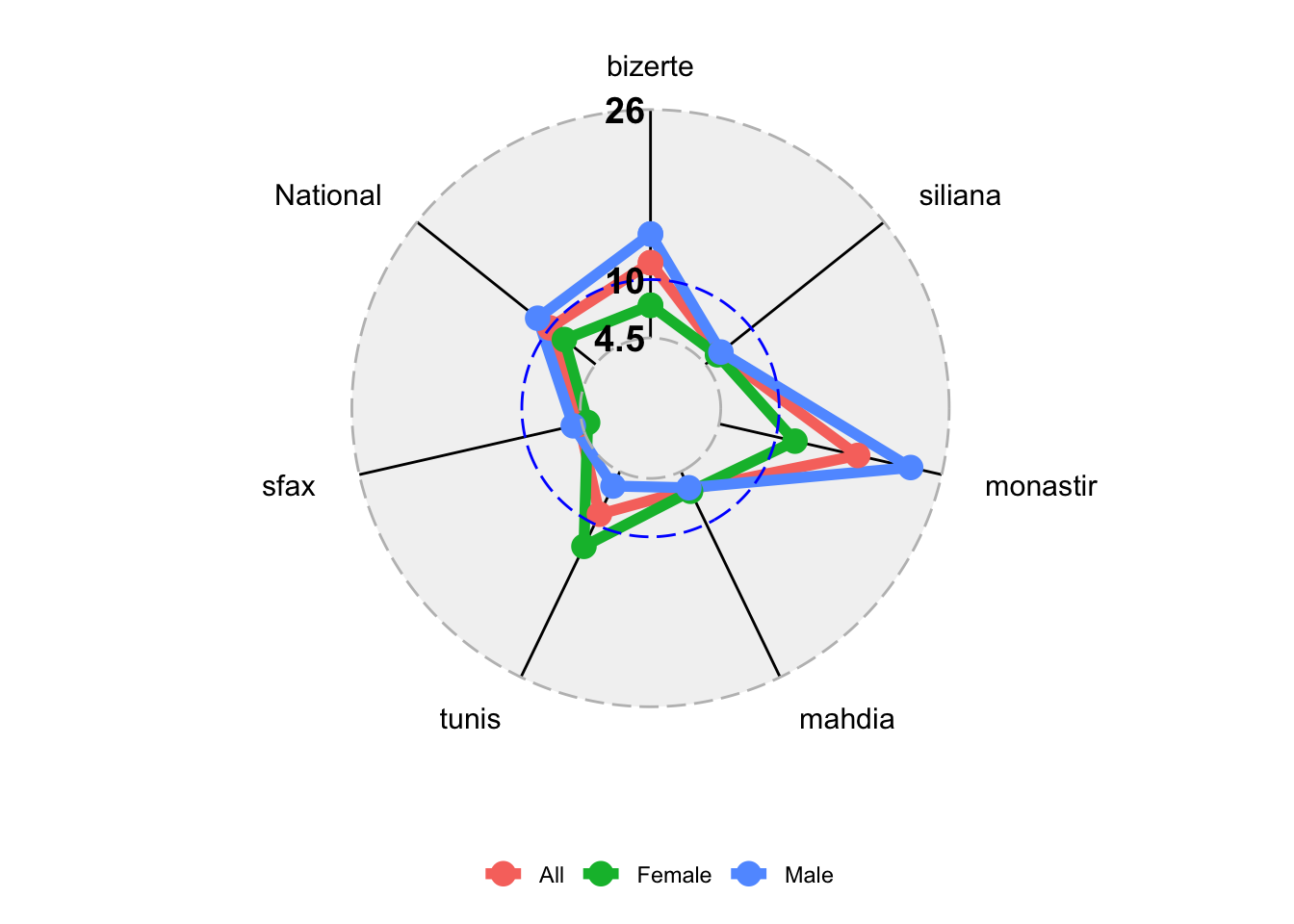
googleVis package
GoogleVis is a famous package where we can find a lot of functions to draw different kind of statistical graphs. You can visit this link to learn more about it: https://cran.r-project.org/web/packages/googleVis/vignettes/googleVis_examples.html
We will show to draw a bar-chart with `GoogleVis. Let us prepare first the data.
> library(googleVis)
Creating a generic function for 'toJSON' from package 'jsonlite' in package 'googleVis'

Welcome to googleVis version 0.6.2

Please read Google's Terms of Use
before you start using the package:
https://developers.google.com/terms/

Note, the plot method of googleVis will by default use
the standard browser to display its output.

See the googleVis package vignettes for more details,
or visit http://github.com/mages/googleVis.

To suppress this message use:
suppressPackageStartupMessages(library(googleVis))
> op <- options(gvis.plot.tag="chart")
> df1=t(df[,-1])
> df1=cbind.data.frame(colnames(df[,-1]),df1)
>
> colnames(df1)=c("Gouvernorat","Female","Male","All")
> df1[,-1]=round(df1[,-1],2)
> df1
         Gouvernorat Female  Male   All
bizerte      bizerte   7.58 14.29 11.59
siliana      siliana   5.95  6.36  6.19
monastir    monastir  11.83 23.00 17.89
mahdia        mahdia   6.57  6.21  6.38
tunis          tunis  12.33  6.02  8.97
sfax            sfax   3.96  5.34  4.74
National    National   8.25 11.47 10.02
The Bar-chart is then
> Bar <- gvisBarChart(df1,xvar="Gouvernorat",
+                     yvar=c("Female","Male","All"),
+                     options=list(width=1250, height=700,
+                                  title="Drop out School Rate",
+                                  titleTextStyle="{color:'red',fontName:'Courier',fontSize:16}",
+                                  bar="{groupWidth:'100%'}",
+                                  hAxis="{format:'#,##%'}"))
> plot(Bar)
We can also add some options
> Bar <- gvisLineChart(df1[,-4],xvar="Gouvernorat",
+                      options=list(width=1250, height=700,
+                                   title="Drop out School Rate",
+                                   titleTextStyle="{color:'red',fontName:'Courier',fontSize:16}",
+                                   bar="{groupWidth:'100%'}",
+                                   vAxis="{format:'#,##%'}"))
> plot(Bar)
2 Quantitative variables, corrplot package
Displaying correlation matrix
CI of correlations
Test of Independences between a set of variables
Correlation matrix
Here’s the correlation matrix with circles proportional to the correlations.
> library(corrplot)
corrplot 0.84 loaded
> data(mtcars)
> head(mtcars)
                   mpg cyl disp  hp drat    wt  qsec vs am gear carb
Mazda RX4         21.0   6  160 110 3.90 2.620 16.46  0  1    4    4
Mazda RX4 Wag     21.0   6  160 110 3.90 2.875 17.02  0  1    4    4
Datsun 710        22.8   4  108  93 3.85 2.320 18.61  1  1    4    1
Hornet 4 Drive    21.4   6  258 110 3.08 3.215 19.44  1  0    3    1
Hornet Sportabout 18.7   8  360 175 3.15 3.440 17.02  0  0    3    2
Valiant           18.1   6  225 105 2.76 3.460 20.22  1  0    3    1
> M <- cor(mtcars)
> corrplot(M, method = "circle")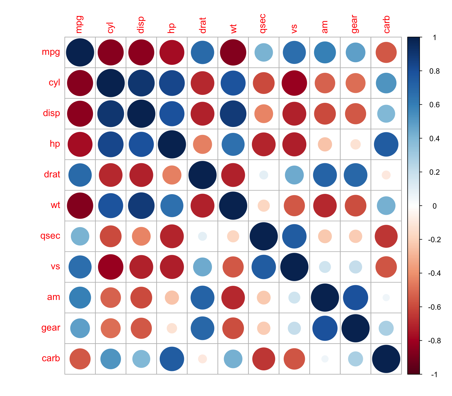
The same thing with squares
> corrplot(M, method = "square")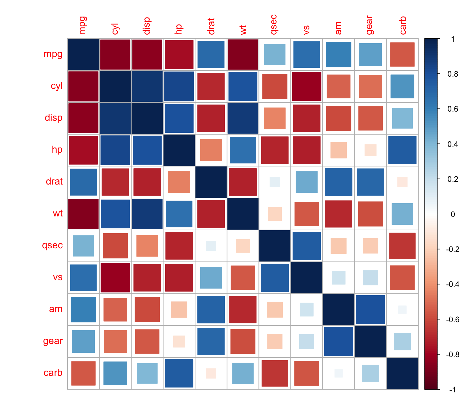
and ellipses
> corrplot(M, method = "ellipse")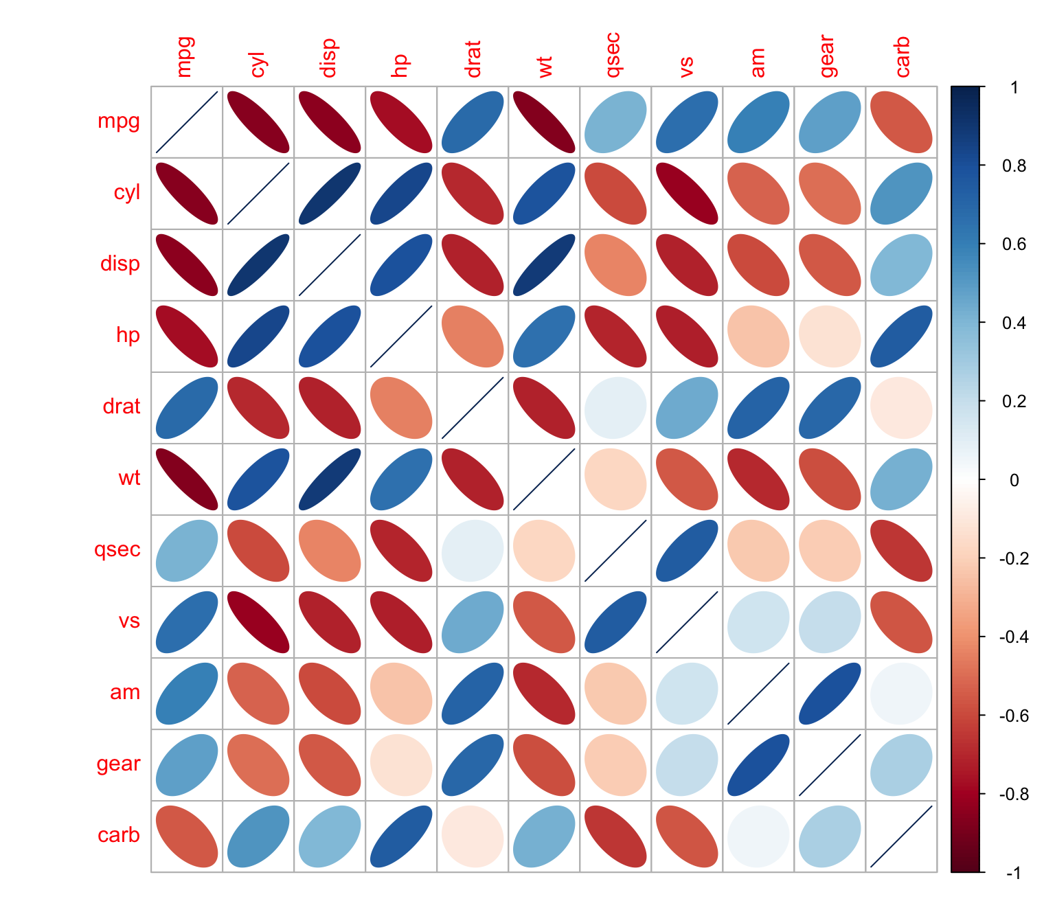
and numbers
> corrplot(M, method = "number")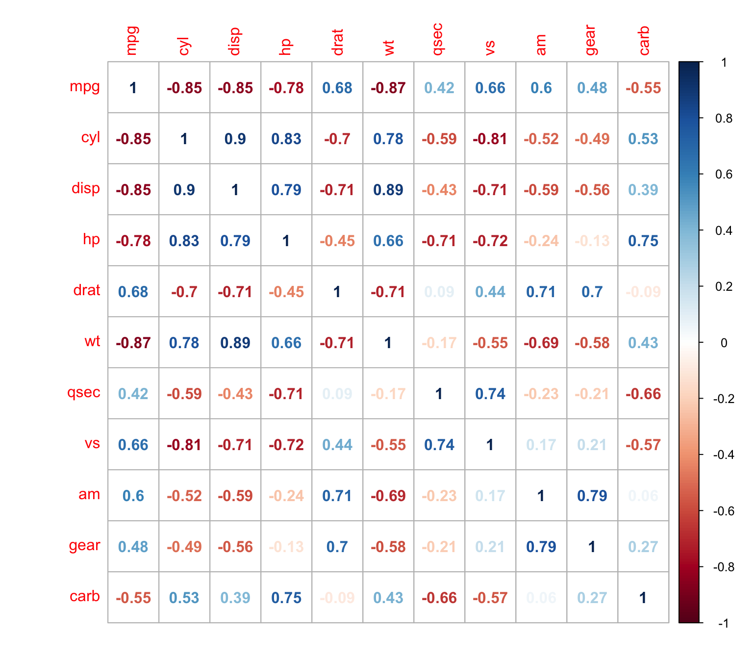
With pies
> corrplot(M, method = "pie")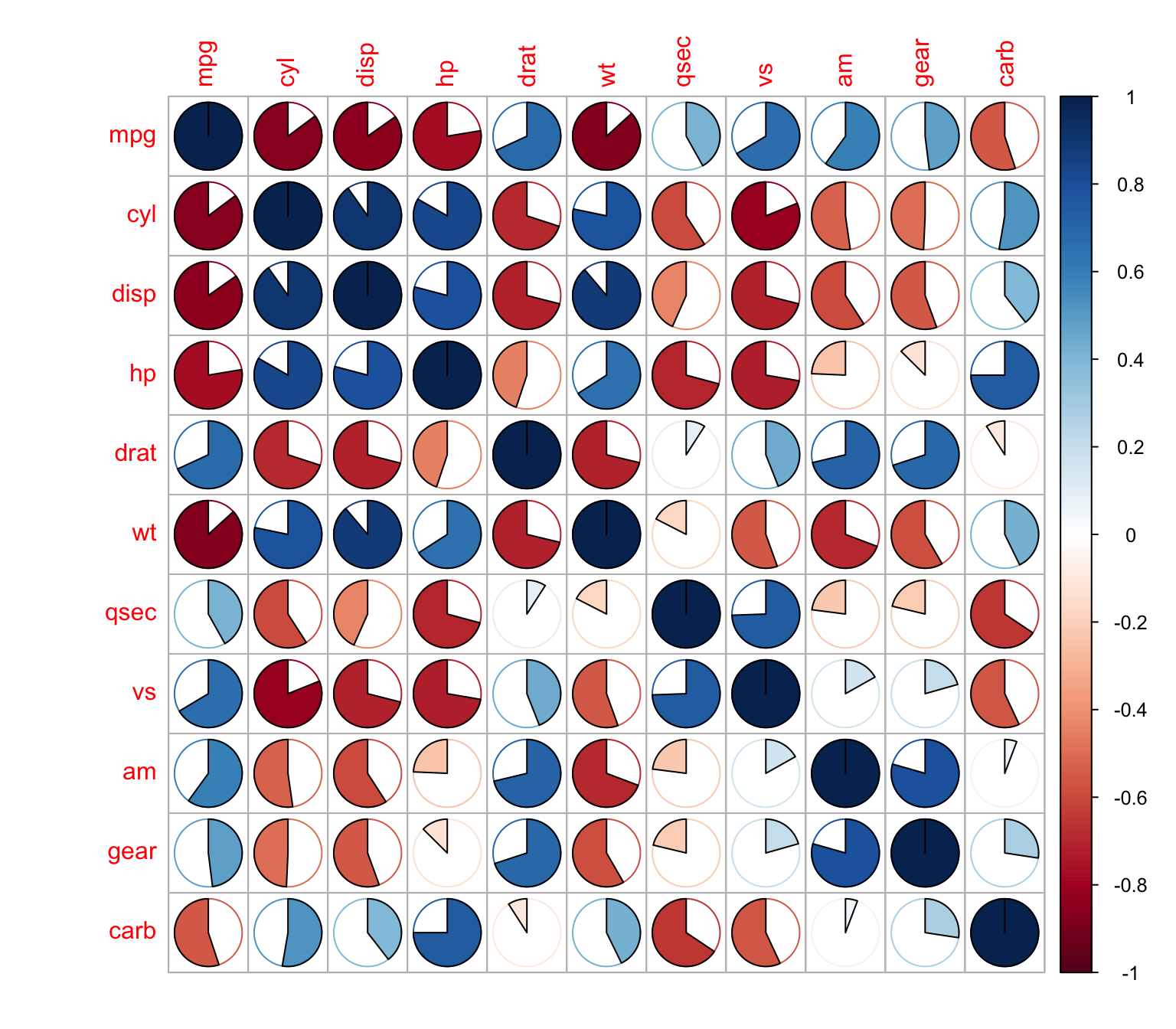
We can plot only the upper matrix
> corrplot(M, type = "upper")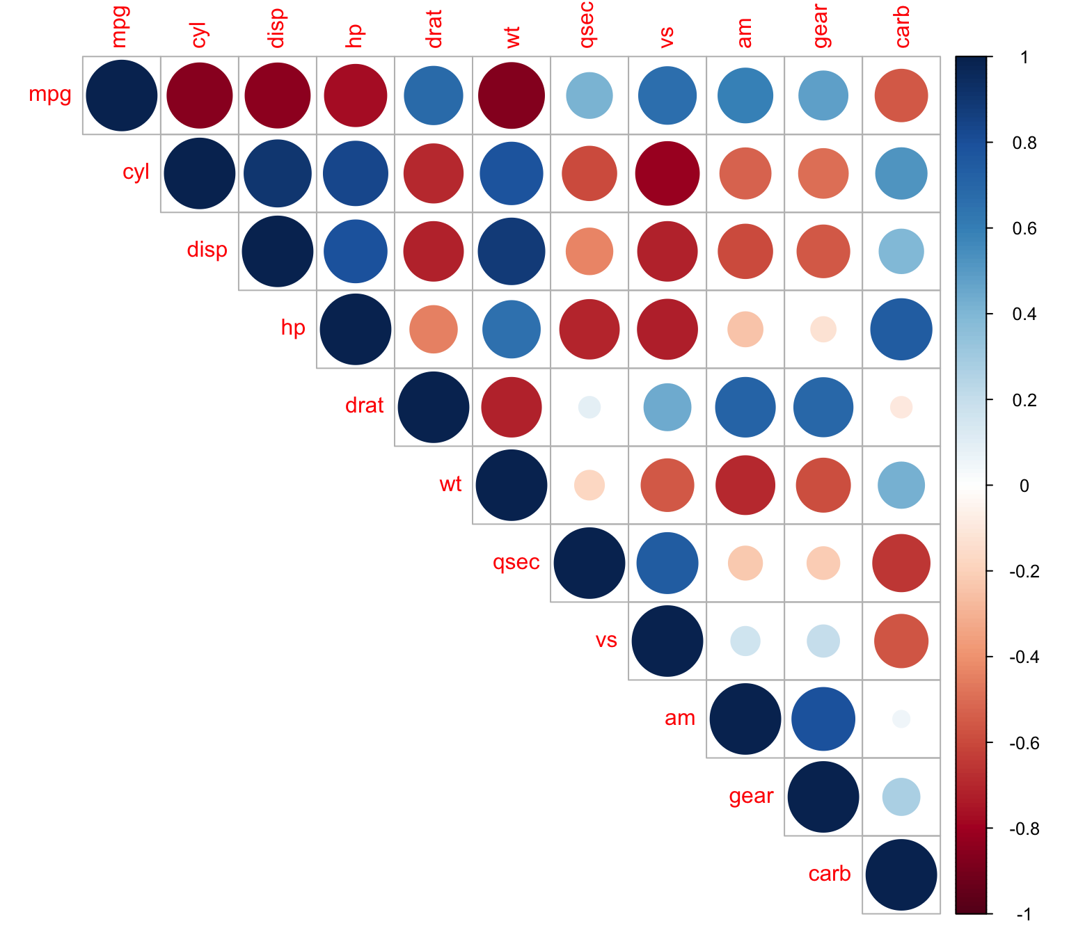
We can combine ellipses and numbers
> corrplot.mixed(M, lower = "ellipse", upper = "number")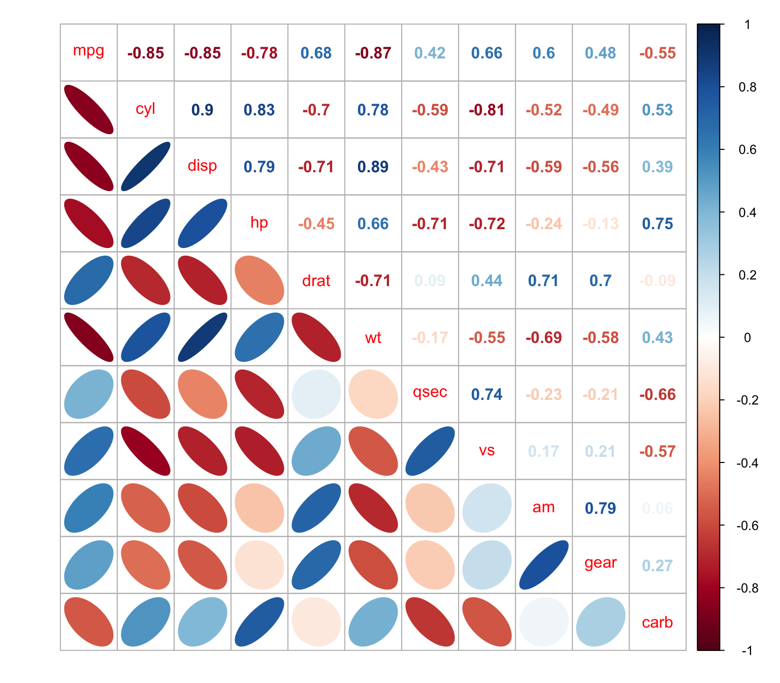
Reordering variables
Character, the ordering method of the correlation matrix.
“original” for original order (default).
“AOE” for the angular order of the eigenvectors.
“FPC” for the first principal component order.
“hclust” for the hierarchical clustering order.
“alphabet” for alphabetical order.
h-clust
> corrplot(M, order = "hclust")
Showing clusters with rectangles
> corrplot(M, order = "hclust",addrect = 3)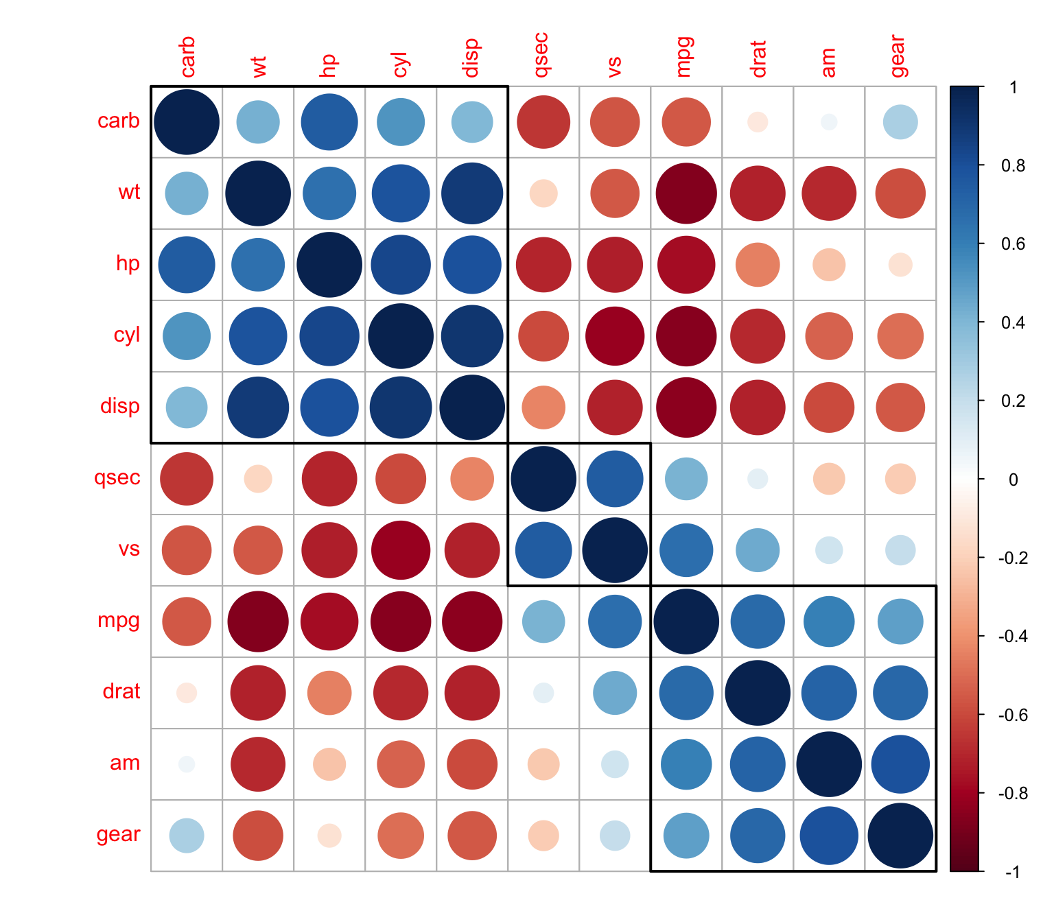
Customizing the plot
Changing Colors
> mycol <- colorRampPalette(c("red", "white", "blue"))
> corrplot(M, order = "hclust",addrect = 2,col=mycol(50))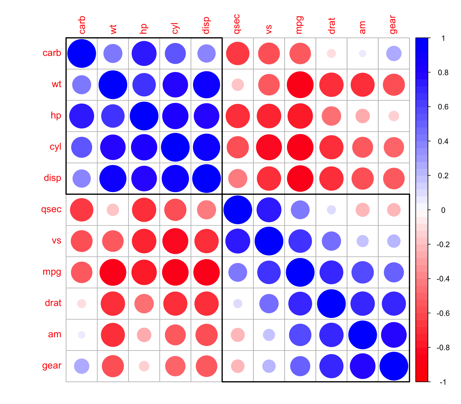
Changing the background
> wb <- c("white", "black")
> corrplot(M, order = "hclust",
+          addrect = 2,
+          col = wb, bg = "gold2")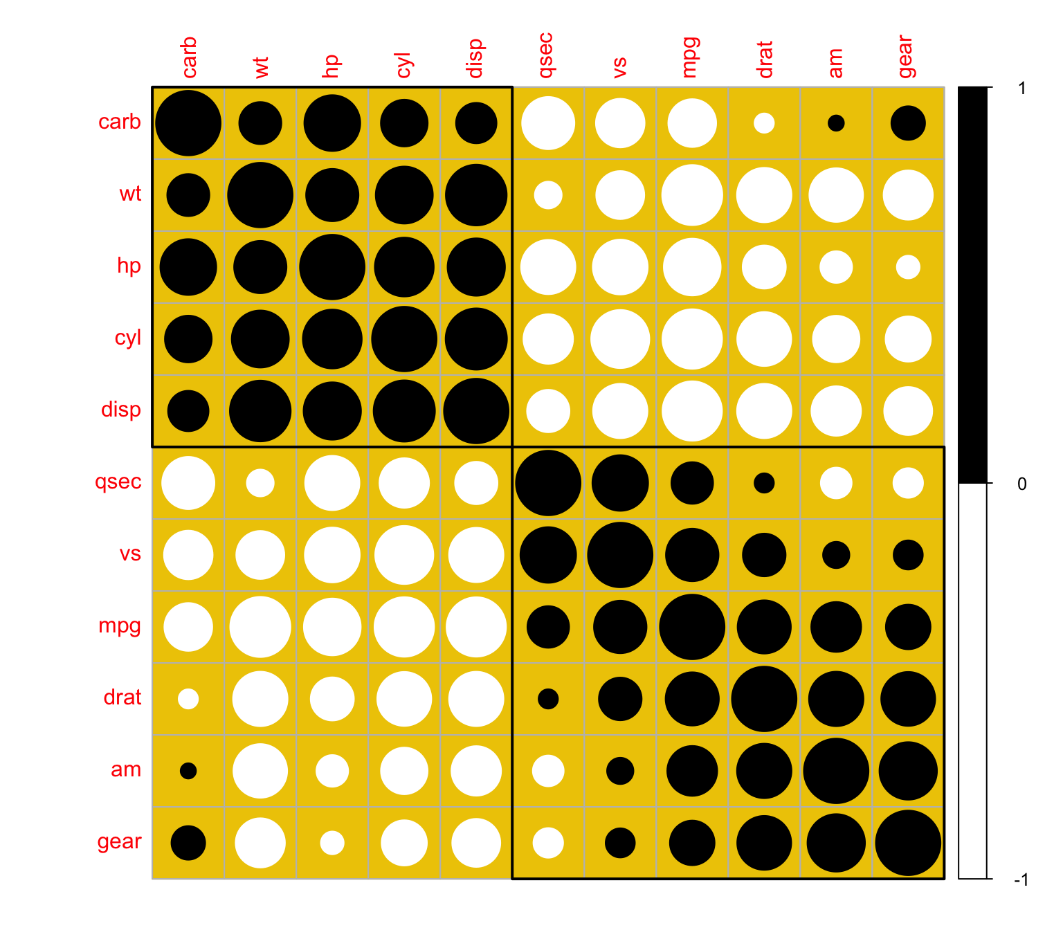
An R code for Independence hypothesis testing
We can also display the result of the hypothesis correlation test by either displaying the p-values or just showing the significant correlations at a given level of significance.
> cor.mtest <- function(mat, conf.level = 0.95) {
+     mat <- as.matrix(mat)
+     n <- ncol(mat)
+     p.mat <- lowCI.mat <- uppCI.mat <- matrix(NA, n, n)
+     diag(p.mat) <- 0
+     diag(lowCI.mat) <- diag(uppCI.mat) <- 1
+     for (i in 1:(n - 1)) {
+         for (j in (i + 1):n) {
+             tmp <- cor.test(mat[, i], mat[, j], conf.level = conf.level)
+             p.mat[i, j] <- p.mat[j, i] <- tmp$p.value
+             lowCI.mat[i, j] <- lowCI.mat[j, i] <- tmp$conf.int[1]
+             uppCI.mat[i, j] <- uppCI.mat[j, i] <- tmp$conf.int[2]
+         }
+     }
+     return(list(p.mat, lowCI.mat, uppCI.mat))
+ }
Let’s perform then the independence hypothesis testing
> res1 <- cor.mtest(mtcars, 0.95)
> res1[[1]][1:3,1:3]
             [,1]         [,2]         [,3]
[1,] 0.000000e+00 6.112687e-10 9.380327e-10
[2,] 6.112687e-10 0.000000e+00 1.802838e-12
[3,] 9.380327e-10 1.802838e-12 0.000000e+00
> res1[[2]][1:3,1:3]
           [,1]       [,2]       [,3]
[1,]  1.0000000 -0.9257694 -0.9233594
[2,] -0.9257694  1.0000000  0.8072442
[3,] -0.9233594  0.8072442  1.0000000
We will now add the p-values
> corrplot(M, p.mat = res1[[1]], sig.level = 0.1)The non-significant independence correlations will be displayed with an X
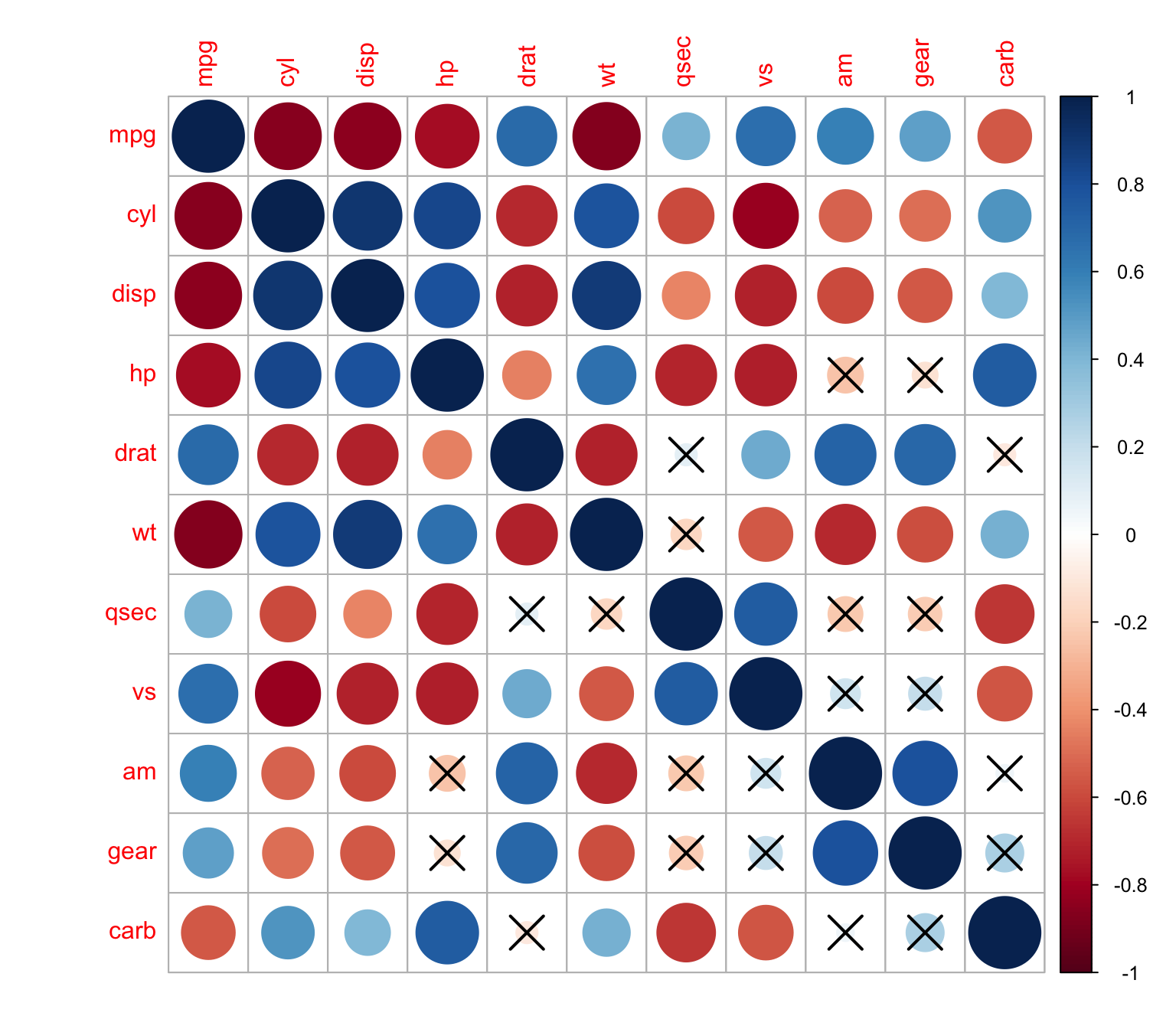
We can change the level of significance
> corrplot(M, p.mat = res1[[1]], sig.level = 0.01)
The p-values can be also displayed in the correlation matrix
> corrplot(M, p.mat = res1[[1]], sig.level = 0.01,insig = "p-value")
We can choose to displaying white squares instead of p-values
> corrplot(M, p.mat = res1[[1]], sig.level = 0.01,insig = "blank")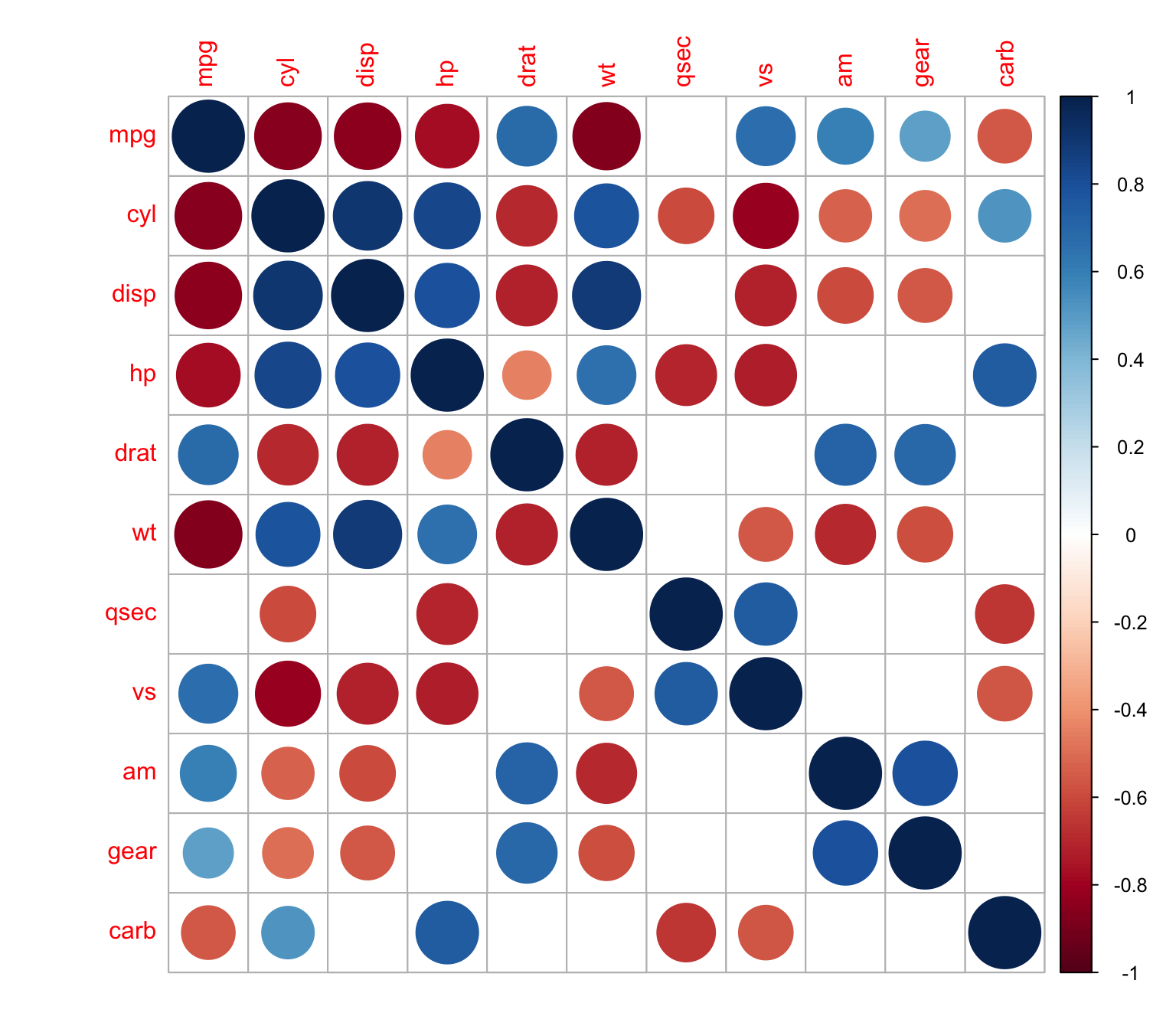
We can also use xtable R package to display nice correlation table in html format
> library(xtable)
> mcor<-round(cor(mtcars),2)
> upper<-mcor
> upper[upper.tri(mcor)]<-""
> upper<-as.data.frame(upper)| mpg | cyl | disp | hp | drat | wt | qsec | vs | am | gear | carb | |
|---|---|---|---|---|---|---|---|---|---|---|---|
| mpg | 1 | ||||||||||
| cyl | -0.85 | 1 | |||||||||
| disp | -0.85 | 0.9 | 1 | ||||||||
| hp | -0.78 | 0.83 | 0.79 | 1 | |||||||
| drat | 0.68 | -0.7 | -0.71 | -0.45 | 1 | ||||||
| wt | -0.87 | 0.78 | 0.89 | 0.66 | -0.71 | 1 | |||||
| qsec | 0.42 | -0.59 | -0.43 | -0.71 | 0.09 | -0.17 | 1 | ||||
| vs | 0.66 | -0.81 | -0.71 | -0.72 | 0.44 | -0.55 | 0.74 | 1 | |||
| am | 0.6 | -0.52 | -0.59 | -0.24 | 0.71 | -0.69 | -0.23 | 0.17 | 1 | ||
| gear | 0.48 | -0.49 | -0.56 | -0.13 | 0.7 | -0.58 | -0.21 | 0.21 | 0.79 | 1 | |
| carb | -0.55 | 0.53 | 0.39 | 0.75 | -0.09 | 0.43 | -0.66 | -0.57 | 0.06 | 0.27 | 1 |
We use corstar function to combine matrix of correlation coefficients and significance levels.
> # x is a matrix containing the data
> # method : correlation method. "pearson"" or "spearman"" is supported
> # removeTriangle : remove upper or lower triangle
> # results :  if "html" or "latex"
>   # the results will be displayed in html or latex format
> corstars <-function(x, method=c("pearson", "spearman"),
+                     removeTriangle=c("upper", "lower"),
+                      result=c("none", "html", "latex")){
+     #Compute correlation matrix
+     require(Hmisc)
+     x <- as.matrix(x)
+     correlation_matrix<-rcorr(x, type=method[1])
+     R <- correlation_matrix$r # Matrix of correlation coeficients
+     p <- correlation_matrix$P # Matrix of p-value
+
+     # Define notions for significance levels; spacing is important.
+     mystars <- ifelse(p < .0001, "****", ifelse(p < .001, "*** ", ifelse(p < .01, "**  ", ifelse(p < .05, "*   ", "    "))))
+
+     # trunctuate the correlation matrix to two decimal
+     R <- format(round(cbind(rep(-1.11, ncol(x)), R), 2))[,-1]
+
+     # build a new matrix that includes the correlations with their apropriate stars
+     Rnew <- matrix(paste(R, mystars, sep=""), ncol=ncol(x))
+     diag(Rnew) <- paste(diag(R), " ", sep="")
+     rownames(Rnew) <- colnames(x)
+     colnames(Rnew) <- paste(colnames(x), "", sep="")
+
+     # remove upper triangle of correlation matrix
+     if(removeTriangle[1]=="upper"){
+       Rnew <- as.matrix(Rnew)
+       Rnew[upper.tri(Rnew, diag = TRUE)] <- ""
+       Rnew <- as.data.frame(Rnew)
+     }
+
+     # remove lower triangle of correlation matrix
+     else if(removeTriangle[1]=="lower"){
+       Rnew <- as.matrix(Rnew)
+       Rnew[lower.tri(Rnew, diag = TRUE)] <- ""
+       Rnew <- as.data.frame(Rnew)
+     }
+
+     # remove last column and return the correlation matrix
+     Rnew <- cbind(Rnew[1:length(Rnew)-1])
+     if (result[1]=="none") return(Rnew)
+     else{
+       if(result[1]=="html") print(xtable(Rnew), type="html")
+       else print(xtable(Rnew), type="latex")
+     }
+ }
>
> corstars(mtcars[,1:7],
+ result="html")
Loading required package: Hmisc
Loading required package: lattice
Loading required package: survival
Loading required package: Formula
Attaching package: 'Hmisc'
The following objects are masked from 'package:xtable':
label, label<-
The following objects are masked from 'package:base':
format.pval, units| mpg | cyl | disp | hp | drat | wt | |
|---|---|---|---|---|---|---|
| mpg | ||||||
| cyl | -0.85**** | |||||
| disp | -0.85**** | 0.90**** | ||||
| hp | -0.78**** | 0.83**** | 0.79**** | |||
| drat | 0.68**** | -0.70**** | -0.71**** | -0.45** | ||
| wt | -0.87**** | 0.78**** | 0.89**** | 0.66**** | -0.71**** | |
| qsec | 0.42* | -0.59*** | -0.43* | -0.71**** | 0.09 | -0.17 |
ggfortify package, visualizing models
Time series
> library(ggfortify)
> head(AirPassengers)
[1] 112 118 132 129 121 135
> class(AirPassengers)
[1] "ts"
> autoplot(AirPassengers)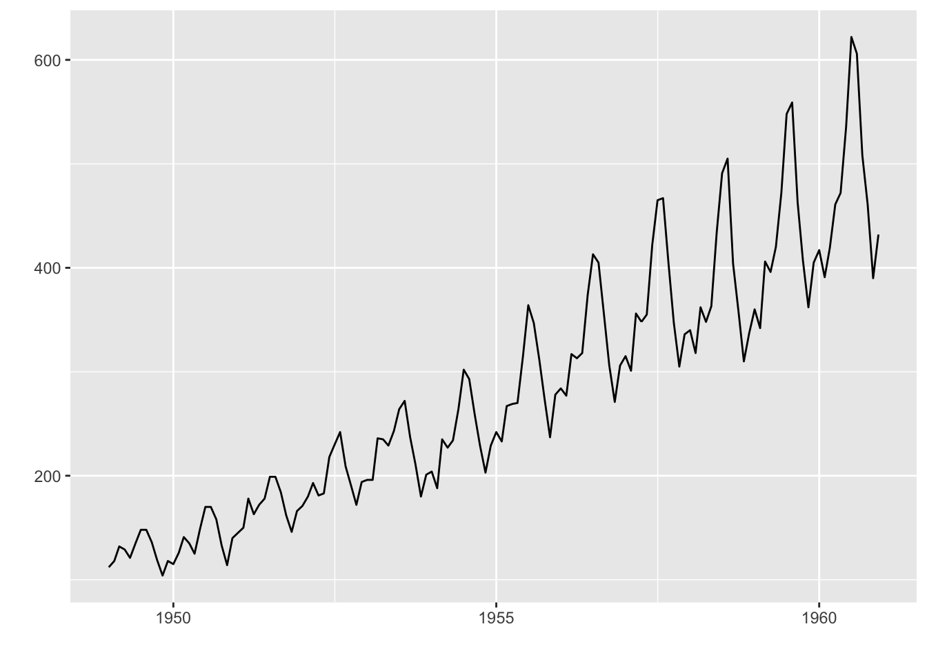
We can customize the graph
> p <- autoplot(AirPassengers)
> p + ggtitle('AirPassengers') + xlab('Year') + ylab('Passengers')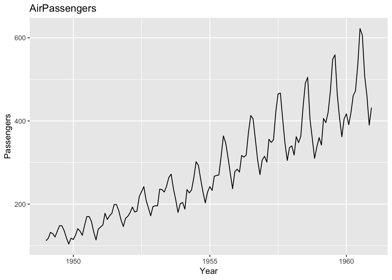
Clustering result
> set.seed(1)
> head(iris)
  Sepal.Length Sepal.Width Petal.Length Petal.Width Species
1          5.1         3.5          1.4         0.2  setosa
2          4.9         3.0          1.4         0.2  setosa
3          4.7         3.2          1.3         0.2  setosa
4          4.6         3.1          1.5         0.2  setosa
5          5.0         3.6          1.4         0.2  setosa
6          5.4         3.9          1.7         0.4  setosa
> p <- autoplot(kmeans(iris[-5], 3), data = iris)
> p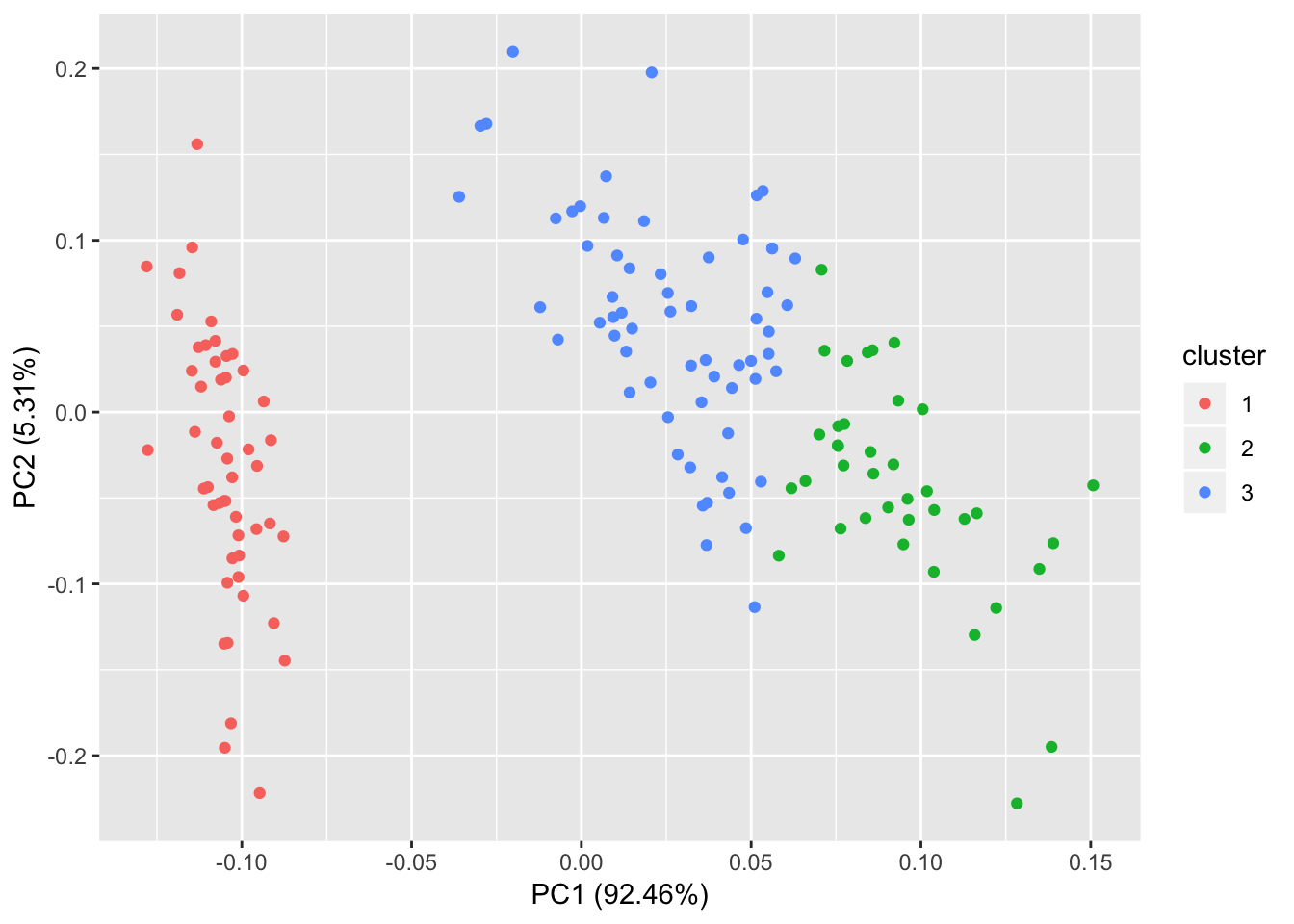
PCA
Individual graph
> df <- iris[c(1, 2, 3, 4)]
> autoplot(prcomp(df))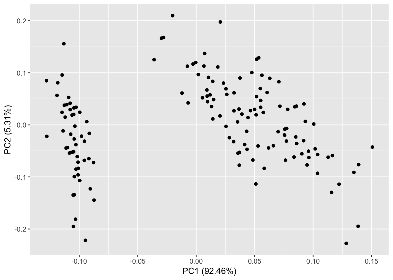
We can show groups using convexes
> autoplot(prcomp(df),
+          data = iris,
+          colour = 'Species',
+          shape = FALSE,
+          label.size = 3, frame=T)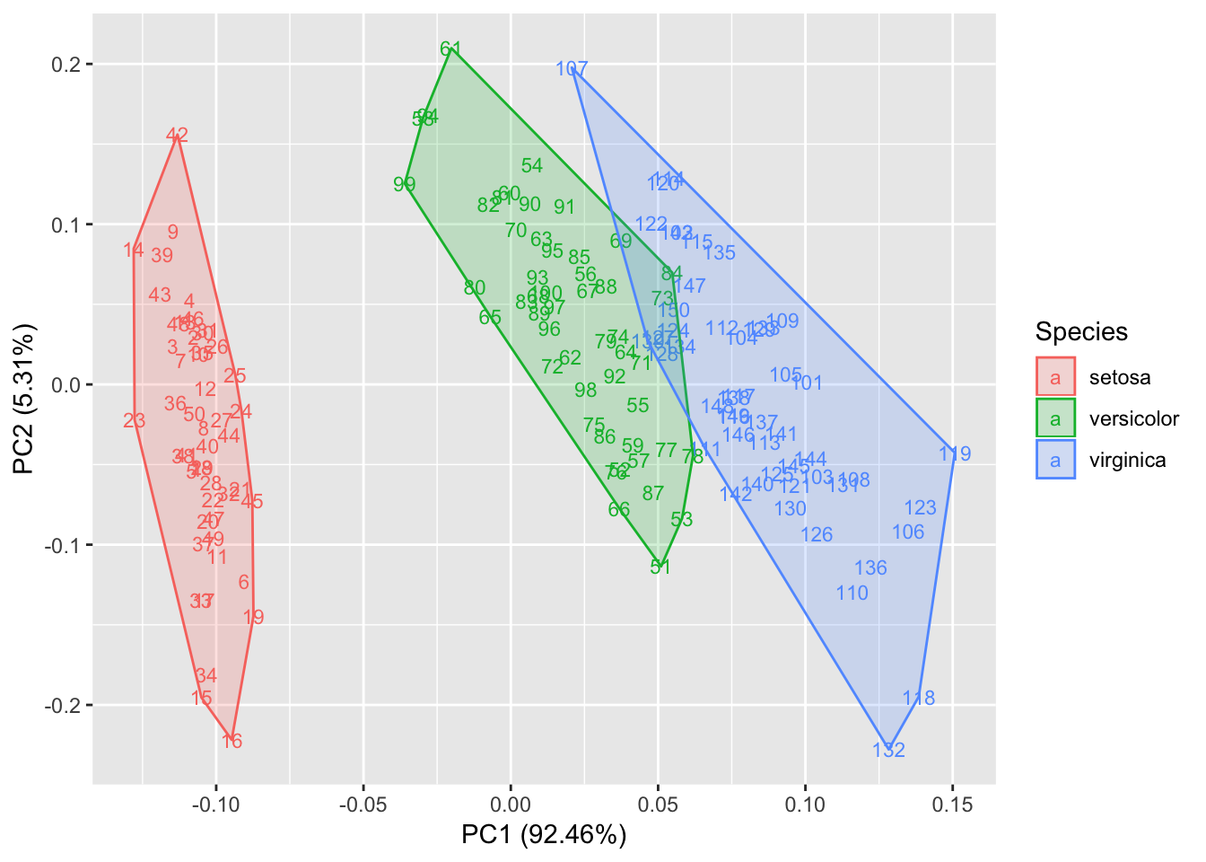
Biplot for a PCA
> autoplot(prcomp(df), data = iris, colour = 'Species',
+          loadings = TRUE, loadings.colour = 'blue',
+          loadings.label = TRUE, loadings.label.size = 3)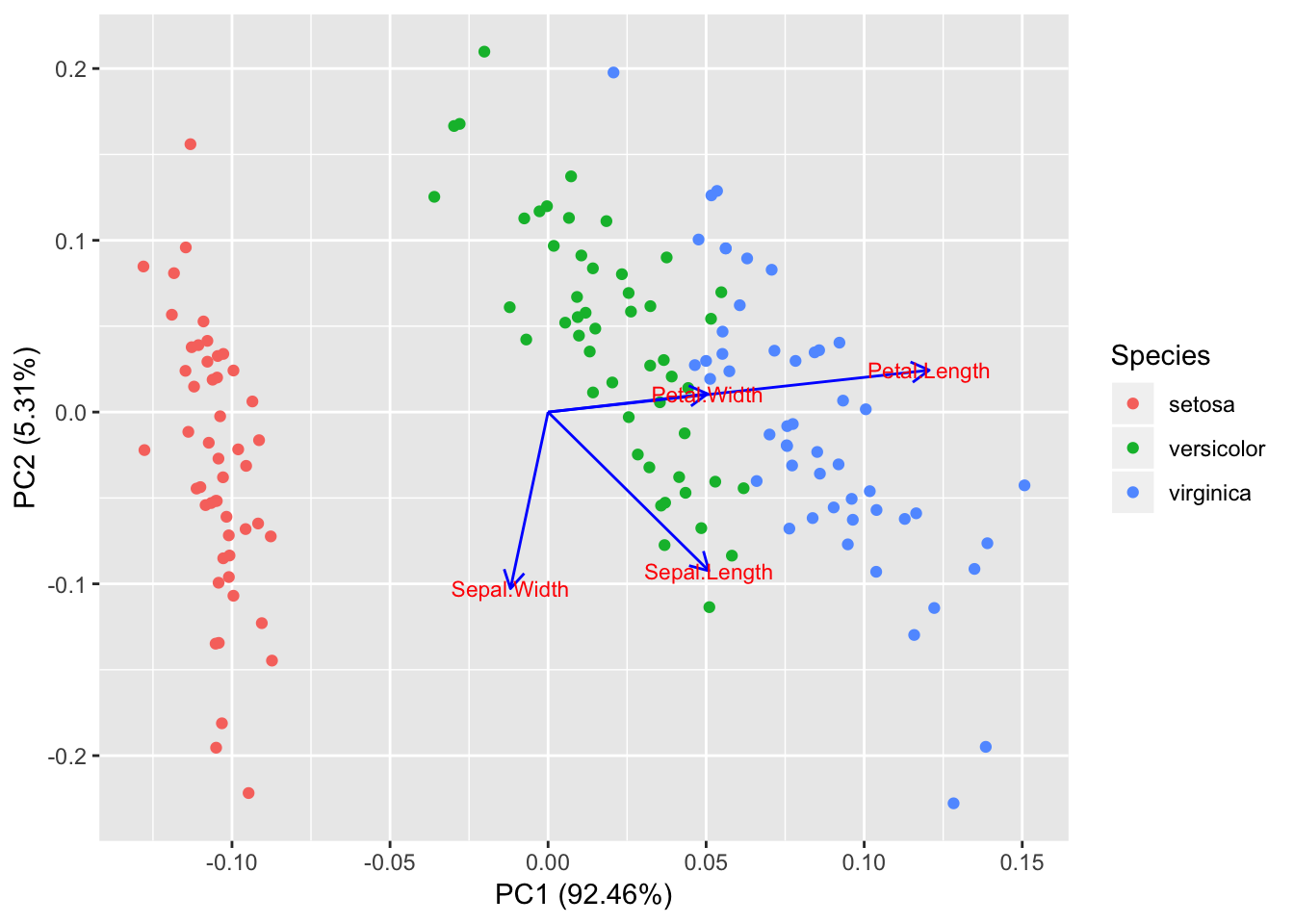
Regression diagnostic
> m <- lm(Petal.Width ~ Petal.Length, data = iris)
> autoplot(m, which = 1:6, colour = 'dodgerblue3',
+          smooth.colour = 'black',
+          smooth.linetype = 'dashed',
+          ad.colour = 'blue',
+          label.size = 3, label.n = 5, label.colour = 'blue',
+          ncol = 3)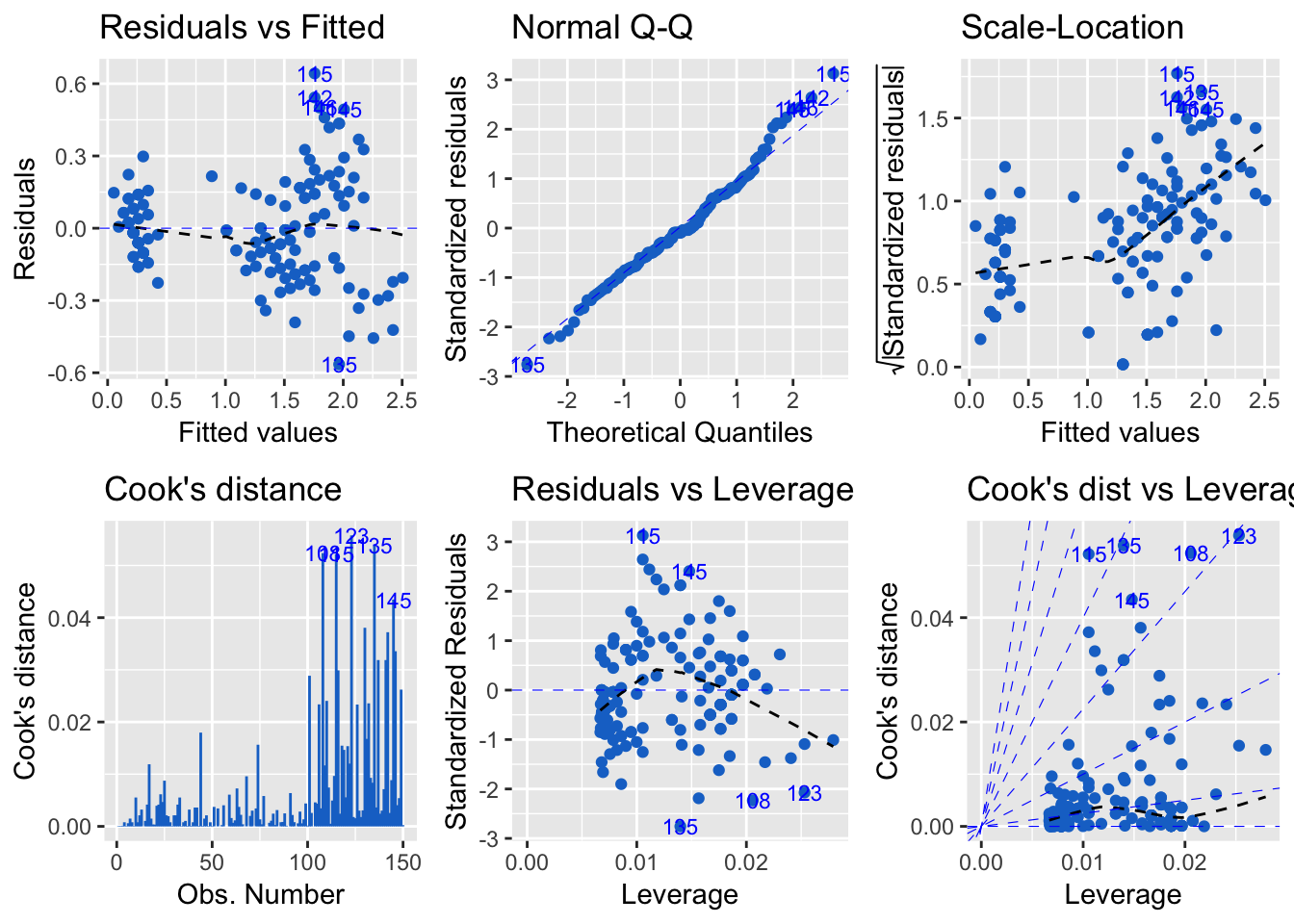
Local Fisher Discriminant Analysis
> library(lfda)
> model <- lfda(x = iris[-5], y = iris[, 5], r = 3, metric="plain")
> autoplot(model,
+          data = iris,
+          frame = TRUE,
+          frame.colour = 'Species')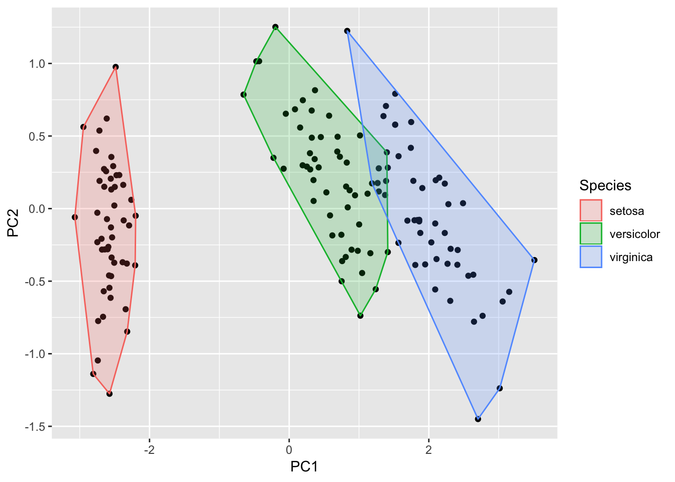
tabplot package
Data
> require(ggplot2)
> data(diamonds)
> head(diamonds)
# A tibble: 6 x 10
  carat cut       color clarity depth table price     x     y     z
  <dbl> <ord>     <ord> <ord>   <dbl> <dbl> <int> <dbl> <dbl> <dbl>
1 0.23  Ideal     E     SI2      61.5    55   326  3.95  3.98  2.43
2 0.21  Premium   E     SI1      59.8    61   326  3.89  3.84  2.31
3 0.23  Good      E     VS1      56.9    65   327  4.05  4.07  2.31
4 0.290 Premium   I     VS2      62.4    58   334  4.2   4.23  2.63
5 0.31  Good      J     SI2      63.3    58   335  4.34  4.35  2.75
6 0.24  Very Good J     VVS2     62.8    57   336  3.94  3.96  2.48
> summary(diamonds)
carat cut color clarity
Min. :0.2000 Fair : 1610 D: 6775 SI1 :13065
1st Qu.:0.4000 Good : 4906 E: 9797 VS2 :12258
Median :0.7000 Very Good:12082 F: 9542 SI2 : 9194
Mean :0.7979 Premium :13791 G:11292 VS1 : 8171
3rd Qu.:1.0400 Ideal :21551 H: 8304 VVS2 : 5066
Max. :5.0100 I: 5422 VVS1 : 3655
J: 2808 (Other): 2531
depth table price x
Min. :43.00 Min. :43.00 Min. : 326 Min. : 0.000
1st Qu.:61.00 1st Qu.:56.00 1st Qu.: 950 1st Qu.: 4.710
Median :61.80 Median :57.00 Median : 2401 Median : 5.700
Mean :61.75 Mean :57.46 Mean : 3933 Mean : 5.731
3rd Qu.:62.50 3rd Qu.:59.00 3rd Qu.: 5324 3rd Qu.: 6.540
Max. :79.00 Max. :95.00 Max. :18823 Max. :10.740
y z
Min. : 0.000 Min. : 0.000
1st Qu.: 4.720 1st Qu.: 2.910
Median : 5.710 Median : 3.530
Mean : 5.735 Mean : 3.539
3rd Qu.: 6.540 3rd Qu.: 4.040
Max. :58.900 Max. :31.800
Exploring Data
> require(tabplot)
> tableplot(diamonds)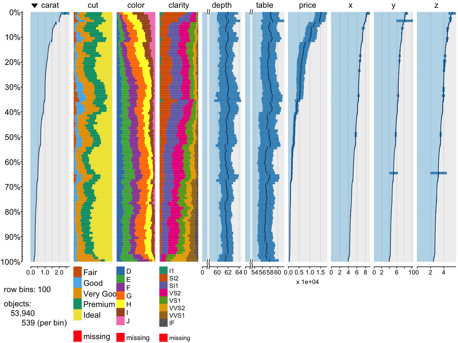
Let’s show on a small example how tabplot works?
> tableplot(diamonds, nBins=2,select =c(carat,color))
We can change values of some arguments
> x=tableplot(diamonds, nBins=2,select =c(carat,color),decreasing = T)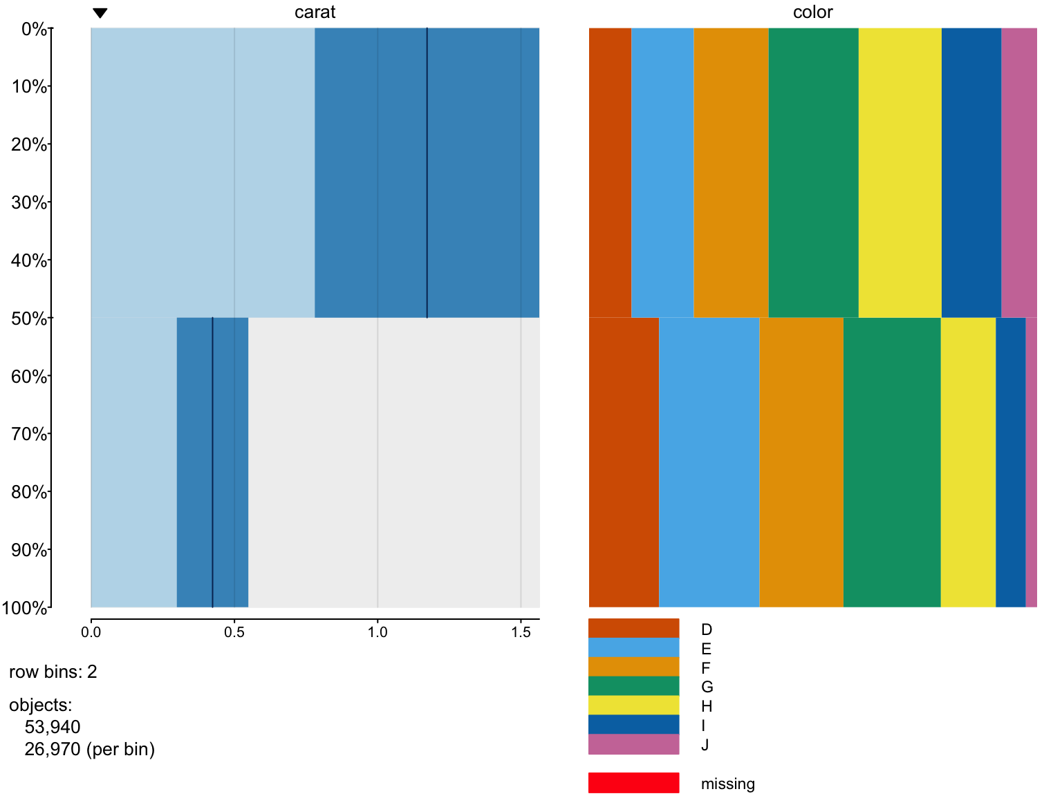
> names(x)
 [1] "dataset"    "select"     "subset"     "nBins"      "binSizes"
 [6] "sortCol"    "decreasing" "from"       "to"         "n"
[11] "N"          "m"          "isNumber"   "rows"       "columns"
[16] "numMode"
>  x$columns$carat$mean
[1] 1.1723063 0.4235732
>  z=sort(diamonds$carat,d=T)
>  dim(diamonds)
[1] 53940    10
>  mean(z[1:26970])
[1] 1.172306
>  mean(z[26971:53940])
[1] 0.4235732
>  x$columns$color$widths
           [,1]      [,2]      [,3]      [,4]      [,5]       [,6]
[1,] 0.09492028 0.1389692 0.1665925 0.2012236 0.1852799 0.13388951
[2,] 0.15628476 0.2242862 0.1872080 0.2174638 0.1226177 0.06714868
           [,7] [,8]
[1,] 0.07912495    0
[2,] 0.02499073    0
>  y=diamonds$color[order(diamonds$carat,decreasing = T)]
>  prop.table(table(y[1:26940]))

         D          E          F          G          H          I
0.09561990 0.13938382 0.16674091 0.20100223 0.18511507 0.13333333
         J
0.07880475
>  prop.table(table(y[26971:53940]))

         D          E          F          G          H          I
0.15550612 0.22376715 0.18694846 0.21757508 0.12298851 0.06781609
         J
0.02539859
Missing values
Displaying missing values
> # add some NA's
> diamonds2=diamonds
> diamonds2$price[which(diamonds2$cut == "Ideal")]<-NA
> diamonds2$cut[diamonds2$depth>65]=NA
> tableplot(diamonds2,colorNA = "black")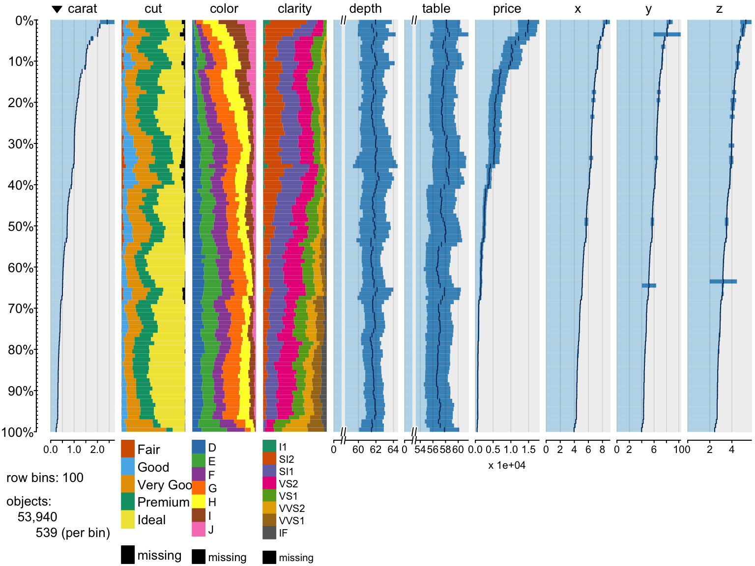
Zooming on data,
> tableplot(diamonds, nBins=5, select = c(carat, price, cut, color, clarity), sortCol = price,
+     from = 0, to = 5)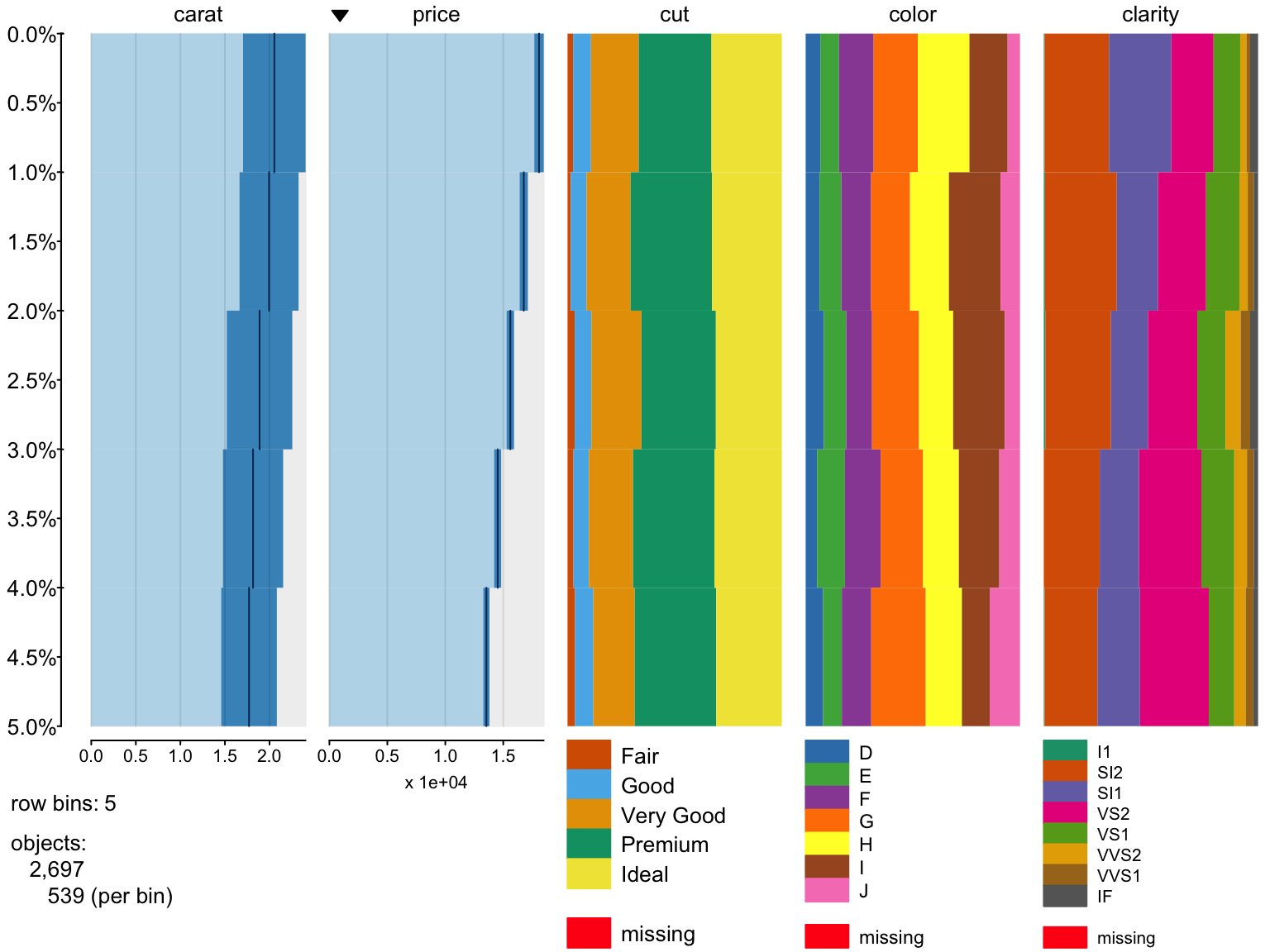
Filtering data
> tableplot(diamonds, subset = price < 5000 & cut == "Premium")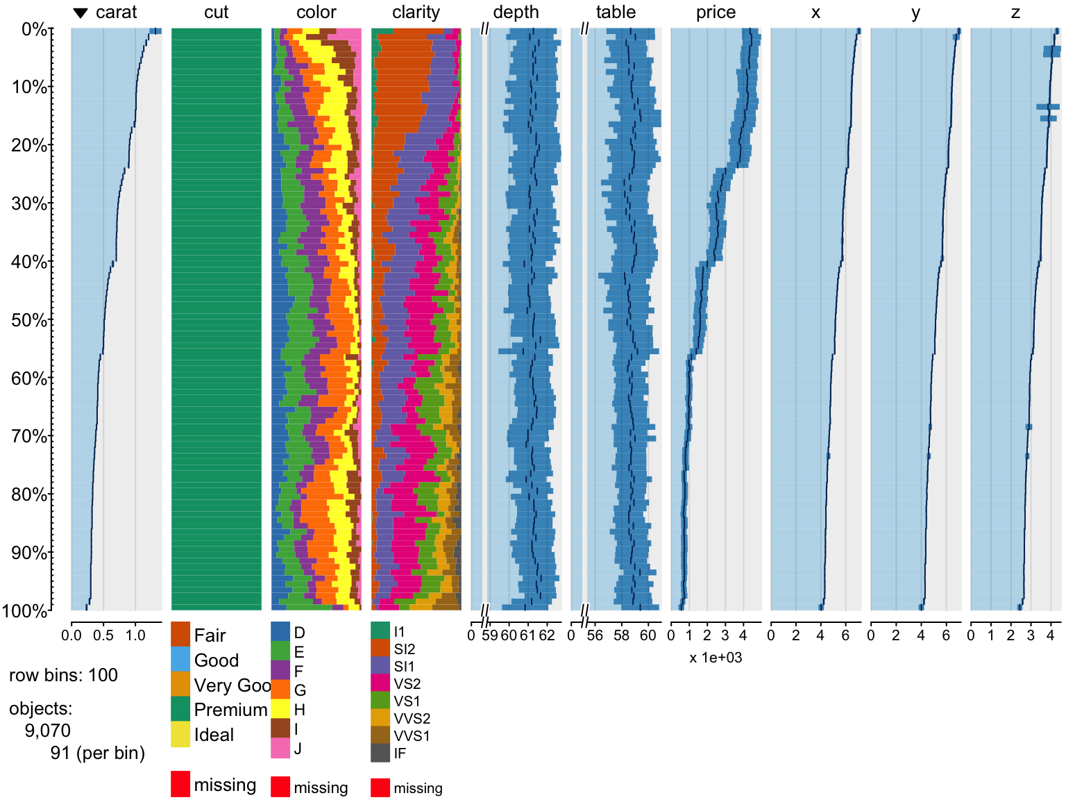
Change colors
> tableplot(diamonds, pals = list(cut="Set1(6)", color="Set5", clarity=rainbow(8)))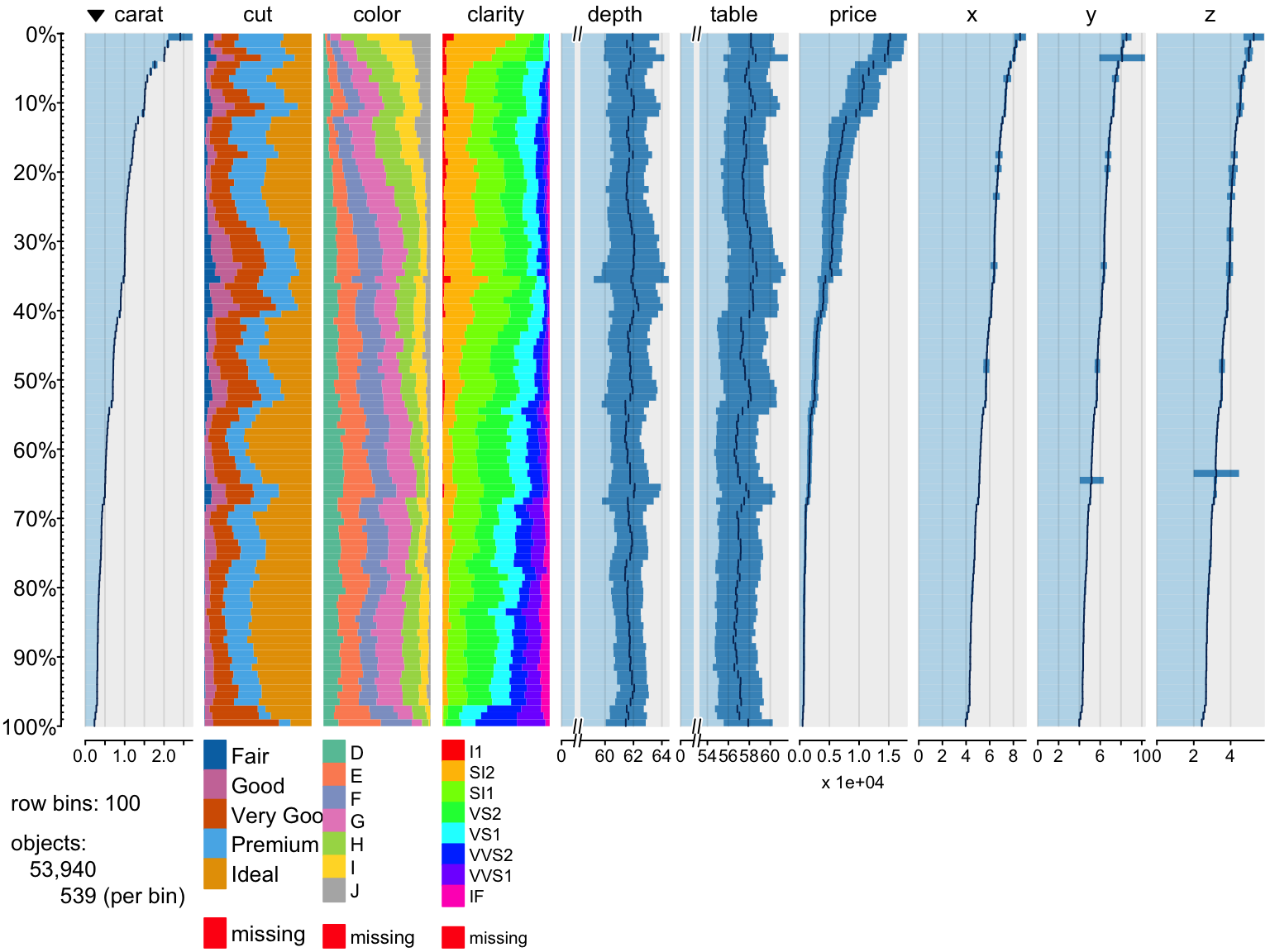
Preprocessing of Large data
Creating a large dataset and plotting using tabplot
>
> large_diamonds <- diamonds[rep(seq.int(nrow(diamonds)), 10),]
> dim(large_diamonds)
[1] 539400     10
> system.time({
+     p <- tablePrepare(large_diamonds)
+ })
   user  system elapsed
  1.198   0.324   1.592