Map of Tunisia with R
Importing shp files
Import the shp files with different resolutions from the following links:
Delegation polygons: https://github.com/malouche/Maps-of-Tunisia-delagations
Gouvernorat polygons: https://github.com/malouche/Maps-of-Tunisia-Gouvernorat
Plot maps of Tunisia
- Loading packages
> library(maptools)
> library(sp)
> library(shapefiles)- Delegations of Tunisia
> tn_deleg<-"/Users/dhafermalouche/Documents/GitHub/Maps-of-Tunisia-delagations/Tunisie_snuts4.shp"
> m_deleg <- readShapePoly(tn_deleg)
> plot(m_deleg)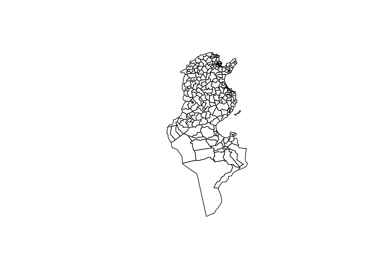
- Gouvernorat of Tunisia
> tn_gouv<-"/Users/dhafermalouche/Documents/GitHub/Maps-of-Tunisia-Gouvernorat/Tunisie_snuts3.shp"
> m_gouv <- readShapePoly(tn_gouv)
> plot(m_gouv)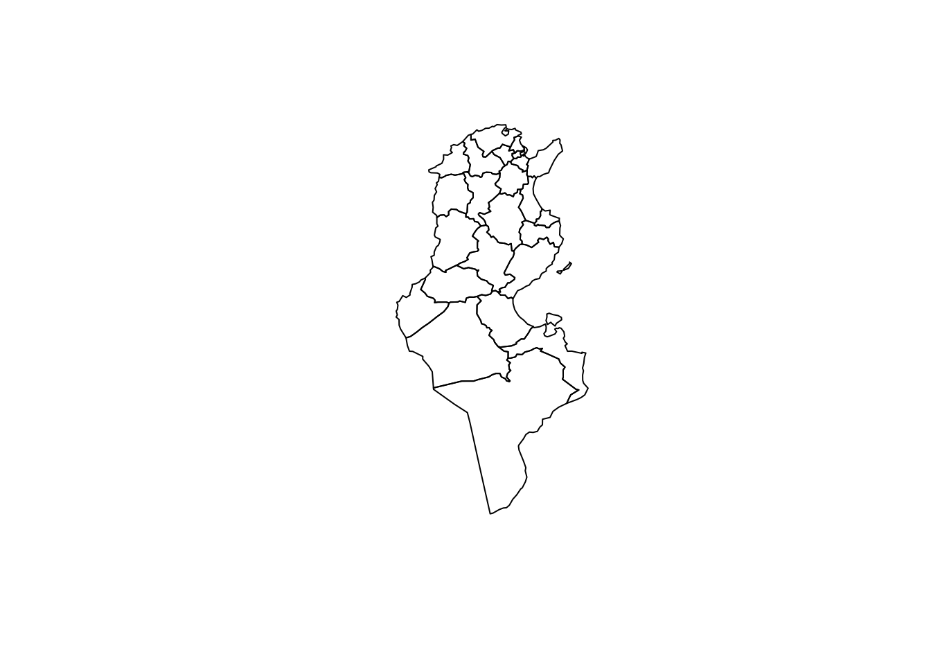
Using raster package
- Delegations
> library(raster)
> m_deleg2<- getData(name="GADM",  country="TUN", level=2)
> plot(m_deleg2)
- Gouvernorat
> m_gouv2<- getData(name="GADM", country="TUN", level=1)> plot(m_gouv2)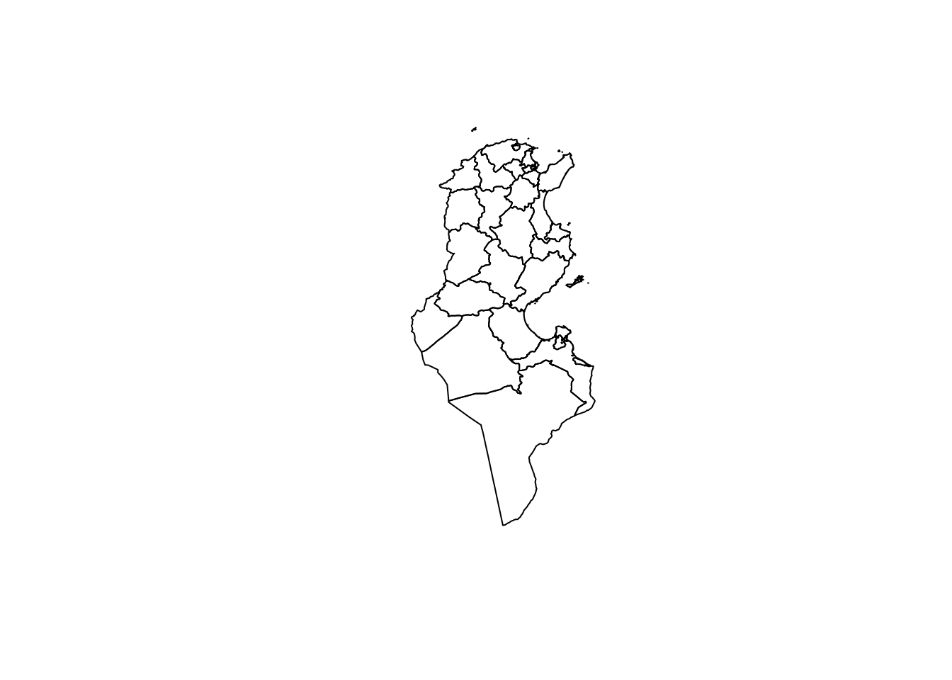
Map with ggplot2
- Delegations
> library(ggplot2)> tn_deleg_fr <- fortify(m_deleg2,region = "HASC_2")> colnames(tn_deleg_fr)
[1] "long" "lat" "order" "hole" "piece" "id" "group"> library(ggplot2)
> p1<-ggplot(tn_deleg_fr, aes(x=long, y=lat, group=group)) +
+ geom_polygon(fill="lightblue",color = "black")+
+ labs(x="",y="")+ theme_bw()+
+ coord_fixed()
> p1<-p1+theme(axis.line=element_blank(),
+ axis.text.x=element_blank(),
+ axis.text.y=element_blank(),
+ axis.ticks=element_blank(),
+ axis.title.x=element_blank(),
+ axis.title.y=element_blank(),
+ panel.grid.major = element_blank(),
+ panel.grid.minor = element_blank(),
+ panel.border = element_blank(),
+ panel.background = element_blank())
> p1<-p1+ theme(legend.position="none")
> p1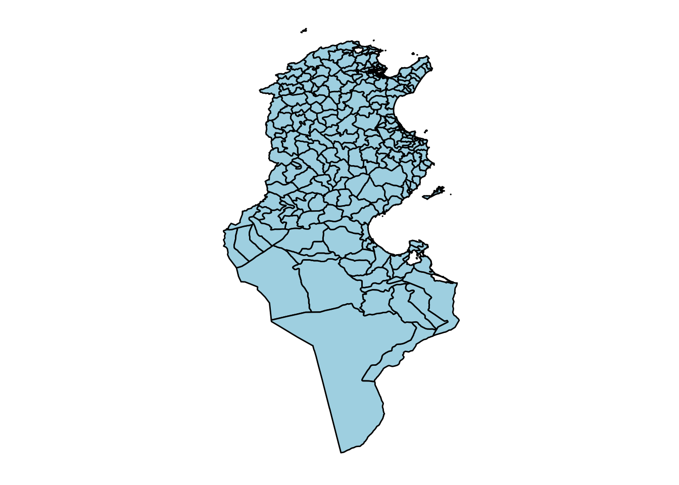
- Gouvernorats:
> tn_gouv_fr <- fortify(m_gouv2,region = "HASC_1")> colnames(tn_gouv_fr)
[1] "long" "lat" "order" "hole" "piece" "id" "group"> p2<-ggplot(tn_gouv_fr, aes(x=long, y=lat, group=group)) +
+ geom_polygon(fill="pink",color = "black")+
+ labs(x="",y="")+ theme_bw()+
+ coord_fixed()
> p2<-p2+theme(axis.line=element_blank(),
+ axis.text.x=element_blank(),
+ axis.text.y=element_blank(),
+ axis.ticks=element_blank(),
+ axis.title.x=element_blank(),
+ axis.title.y=element_blank(),
+ panel.grid.major = element_blank(),
+ panel.grid.minor = element_blank(),
+ panel.border = element_blank(),
+ panel.background = element_blank())
> p2<-p2+ theme(legend.position="none")
> p2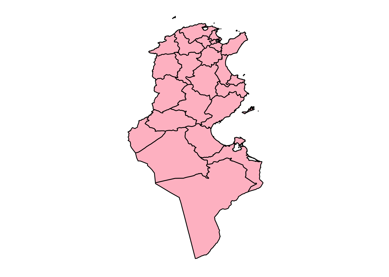
Choropleth Maps
It’s a thematic map in which areas are shaded or patterned in proportion to the measurement of the statistical variable being displayed on the map.
Let’s make a map of Tunisia at the level of Gouvernorat and represents the Development Regional Index in 2010.
Let’s then import the data into
R. This data is available in https://www.kaggle.com/dhafer/regional-development-index-tunisia. Let’s then import firt intoR
> library(readr)
> dt<-read_csv("idr_gouv.csv")> dt1=as.data.frame(dt)
> head(dt1)
HASC_1 gouvernorat IDR
1 TN.TU TUNIS 0.76
2 TN.AN ARIANA 0.69
3 TN.BA BEN AROUS 0.66
4 TN.MS MONASTIR 0.64
5 TN.SS SOUSSE 0.62
6 TN.NB NABEUL 0.57Let us notice the presence of a variable
HASC_1. We need then to merge this later data using this columnWe download the Tunisian map with polygons at the level of Gouvernorats:
> library(raster)
> m_gouv2<- getData(name="GADM", country="TUN", level=1)> m_gouv2@data$HASC_1[1:4]
[1] "TN.AN" "TN.BJ" "TN.BA" "TN.BZ"Choropleth Maps with ggplot2
Data at the level of Gouvernorats
- We need first to use
fortifyfromggplot2package and we will merge the new fortified data with the data containing the variable of interest and theHASC_1variable.
> library(ggplot2)
> tn_gouv_fr <- fortify(m_gouv2,region = "HASC_1")> i=match(tn_gouv_fr$id,dt1$HASC_1)
> tn_gouv_fr$IDR=dt1$IDR[i]
> colnames(tn_gouv_fr)
[1] "long" "lat" "order" "hole" "piece" "id" "group" "IDR" - Here’s then choropleth map:
>  p2<-ggplot(tn_gouv_fr, aes(x=long, y=lat, group=group)) +
+     geom_polygon(aes(fill=IDR),color = "black")+
+     labs(x="",y="")+ theme_bw()+
+     coord_fixed()
> p2<-p2+theme(axis.line=element_blank(),
+      axis.text.x=element_blank(),
+        axis.text.y=element_blank(),
+        axis.ticks=element_blank(),
+        axis.title.x=element_blank(),
+        axis.title.y=element_blank(),
+      panel.grid.major = element_blank(),
+      panel.grid.minor = element_blank(),
+      panel.border = element_blank(),
+      panel.background = element_blank())
>  p2<-p2+ theme(legend.position="right")
>  p2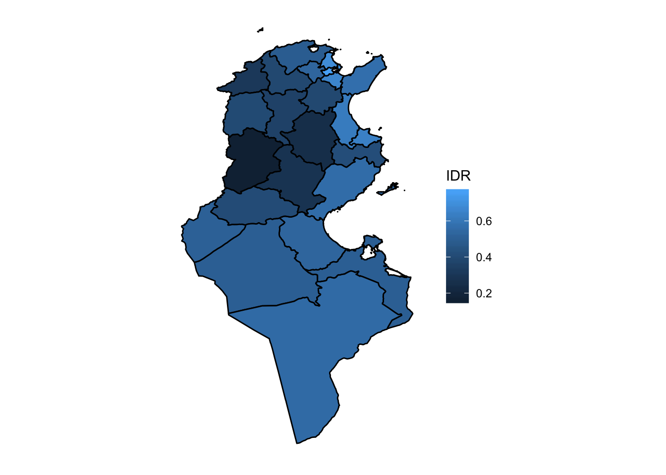
Data at the level of delegations
- I will consider a data available in my Kaggle account where you can find several statistics about Tunisia at the level of delegations. You can find this data in the following link: https://www.kaggle.com/dhafer/eco-and-politics-data-on-tunisian-delegations. We will be interested here to display the difference of votes for Nahdha party between the Elections 2014 and 2011. We will consider a new indicator defined by \[\Delta\mbox{votes}=\displaystyle\frac{\mbox{Votes}(2011)-\mbox{Votes}(2014)}{\mbox{Votes}(2011)}\times 100\] It indicates the percentage of votes lost or gain from 2011 to 2014.
> library(readr)
> dt2<-read_csv("data_delegation_tunisia.csv")
> dt2=as.data.frame(dt2)
> head(dt2[,1:3])
Gouvernorat delegation HASC_2
1 Ariana Ariana-Ville TN.AN.AR
2 Ariana Ettadhamen TN.AN.ET
3 Ariana Kalaat-Landlous TN.AN.KA
4 Ariana La-Soukra TN.AN.LS
5 Ariana Mnihla TN.AN.MN
6 Ariana Raoued TN.AN.RA- We load then the map at the delegation level and this time we should look to the
HASC_2variable
> library(raster)
> m_deleg2<- getData(name="GADM",  country="TUN", level=2)
> m_deleg2@data$HASC_2[1:4]
[1] "TN.AN.AR" "TN.AN.ET" "TN.AN.KA" "TN.AN.MN"- We compute the new variable
> x=(dt2$Nahdha_2011-dt2$Nahdha_2014)/dt2$Nahdha_2011*100
> summary(x)
   Min. 1st Qu.  Median    Mean 3rd Qu.    Max.    NA's
-36.59 26.46 38.76 33.47 45.21 65.29 3 - We use then
fortifyfunction and bind the new column to the data that will be displayed
> library(ggplot2)
> tn_deleg_fr <- fortify(m_deleg2,region = "HASC_2")
> i=match(tn_deleg_fr$id,dt2$HASC_2)
> tn_deleg_fr$DeltaVotes=x[i]- Here’s the map then and we will add title to the legend and change the color when we fill the map. Negative differences (gain of votes) will be positive and Positive differences (lost of votes) will be represented in red.
> library(scales)
>  p2<-ggplot(tn_deleg_fr, aes(x=long, y=lat, group=group)) +
+     geom_polygon(aes(fill=DeltaVotes),color = "black")+
+     labs(x="",y="")+ theme_bw()+
+     coord_fixed()
> p2<-p2+scale_fill_gradientn(colours=c("blue","white","red"),
+     values=rescale(c(-100,0,100)))
>
> p2<-p2+theme(axis.line=element_blank(),
+      axis.text.x=element_blank(),
+        axis.text.y=element_blank(),
+        axis.ticks=element_blank(),
+        axis.title.x=element_blank(),
+        axis.title.y=element_blank(),
+      panel.grid.major = element_blank(),
+      panel.grid.minor = element_blank(),
+      panel.border = element_blank(),
+      panel.background = element_blank())
>  p2<-p2+ theme(legend.position="right")
>  p2+labs(fill = "% of the Diff, \n  of Votes \n 2011 - 2014")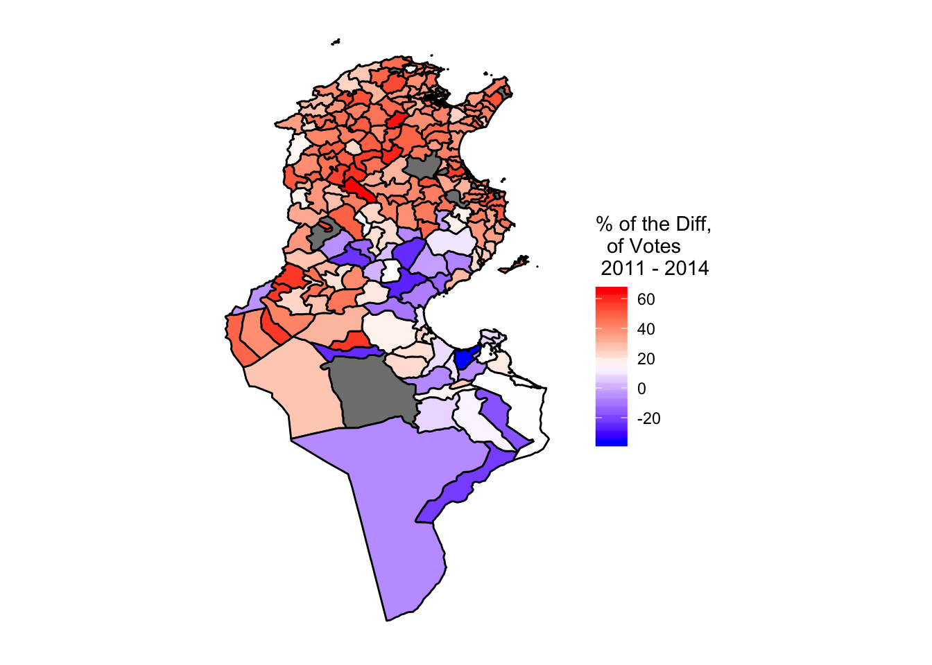
with spplot function
spplotis a function from the packagelaticethat can be used to plot choropleth maps. Let us use it on the previous example
> library(lattice)
> i=match(m_deleg2@data$HASC_2, dt2$HASC_2)
> m_deleg2@data$DeltaVotes=x[i]
> spplot(m_deleg2,"DeltaVotes",
+        main="% of the Diff, \n  of Votes \n 2011 - 2014",sub="",
+        col.regions=colorRampPalette(c('blue', 'white','red'))(30))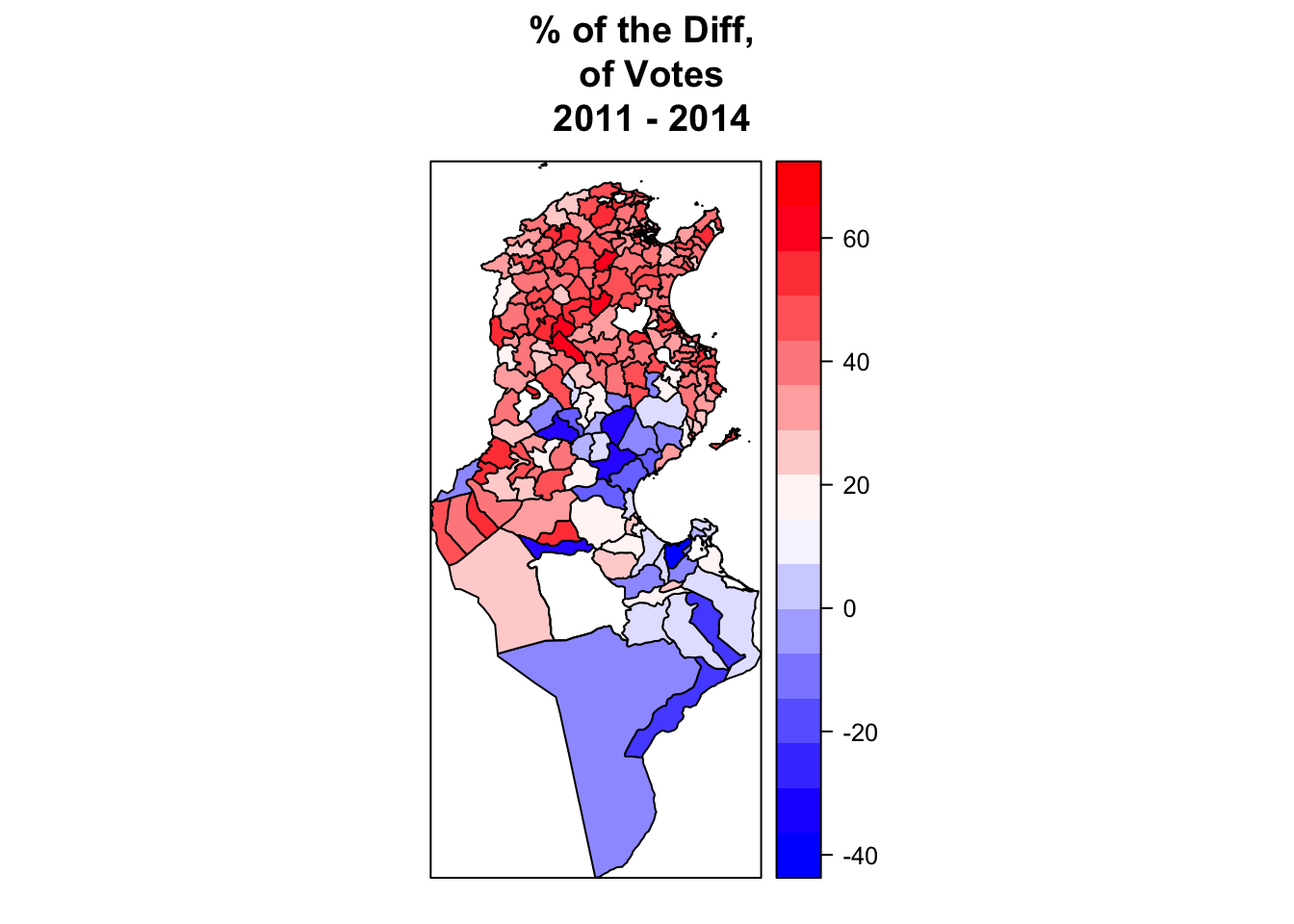
Using Leaflet package
Leafletis one of the most popular open-source JavaScript libraries for interactive maps. To learn more about it visit: https://rstudio.github.io/leaflet/Let us now see how can we create interactive maps with
leafletRpackageWe will then represent again the variable `
Difference of votes'' added above to the delegation mapm_deleg2`. We will also add popups that help the user when clicking on a polygone to know the name of the delgation and the value of the variable at this delegation.we start then by the popups
> my_popup <- paste0("<strong>",m_deleg2@data$NAME_2,"</strong>"," (",round(m_deleg2@data$DeltaVotes,1),"%)")
> my_popup[1:4]
[1] "<strong>Ariana Médina</strong> (34.6%)"
[2] "<strong>Ettadhamen</strong> (50.6%)"
[3] "<strong>Kalaat El Andalous</strong> (45.4%)"
[4] "<strong>Mnihla</strong> (44.7%)" - Now we create the palette of colors. Since the range of the variable is between -40 to 70, we choose a domain between also -40 to 70. We will also create a palette of 11 colors.
> library(leaflet)
>
> MyPaletteColor <- colorBin("RdYlBu", domain=(-40):70,bins=11,na.color = "white")- Our map then with
leaflet
> mm<-leaflet(data = m_deleg2) %>%
+     addProviderTiles("CartoDB.Positron") %>%
+     addPolygons(fillColor = ~MyPaletteColor(m_deleg2@data$DeltaVotes),
+                 fillOpacity = 0.8,
+                 color = "#BDBDC3",
+                 weight = 1,
+                 popup = my_popup)
> mm